About this guide
This is the extended guide. It tries to be as complete as possible manual for all features of the RC. If you just want to get started quickly with creating an exposition, be sure to check the quick start guide or the video tutorials first.
About the Research Catalogue
The Research Catalogue (RC) is a non-commercial, collaboration and publishing platform for artistic research provided by the Society for Artistic Research. The RC is free to use and access for artists and researchers. It serves also as a backbone for teaching purposes, student assessment, peer review workflows and research funding administration. It strives to be an open space for experimentation and exchange.
Research Catalogue (RC) content presented through some of our portals is peer reviewed, while the remaining expositions and other information are quality controlled by the individual author(s) themselves. As a result, the RC is highly inclusive.
The open access and open source spirit of the RC is essential to its nature and serves its function as a connective and transitional layer between academic discourse and artistic practice, thereby constituting a discursive field for artistic research.
The Research Catalogue is provided by the Society for Artistic Research (SAR).
What is the RC used for?
Research Catalogue can be used for creating research documentation, editing articles, reports, collaborative writing, thesis/dissertation works, peer reviewed journal publications and class logbooks.
It can also be used to present research data in a human friendly layout.

What is an RC Exposition?
Unlike traditional research repositories, which present data as PDF documents or folders of files, the RC employs a unique format: a free form, flexible and media-friendly webpage, called an exposition.
This format is particularly well-suited for merging different forms of media and text into a single highly customizable presentation. The flexibility in structure accommodates the diverse, context-specific needs of organizing materials produced in artistic research.
If you want to know more this may be a good starting point:
Expositionality
in Action (Michael Schwab 2024)
Connection Between RC and JAR
The RC forms the technical backbone of the Journal for Artistic Research (JAR): potential JAR expositions emerge from the range of the artistic research activities taking place in the RC. Moreover, submissions and peer-reviewing for JAR takes place in the RC. Expositions published in JAR are either nominated by authors, or directly selected by JAR editorial board.
Setting up a New Account
When you register an account in the RC, you will first just have a basic account. This will allow you to be a supervisor, review expositions, and leave comments. Some application calls may also accept limited user accounts to submit forms.
Limited accounts do not have the option to create expositions or publish work. Due to copyright laws, if you are interested in making your content public in the Research Catalogue, you need to register as author by upgrading your limited account to a full account.
Important: if you are a student or staff member of an institution that has a portal within the RC, you should contact your local portal admin for receiving the full account.
Upgrading to full account
If you have a limited account (this includes all SARA subscribers): you can upgrade it via the upgrade page.
The account upgrade is free of charge. You can upgrade your limited account by logging in, and clicking “request upgrade”, where you will be instructed to send in a proof of identity to support@researchcatalogue.net. Please read about “safe upgrade” below, to make sure you send this information safely.
| Limited account | Full Account |
|---|---|
| comment | comment |
| review | review |
| create applications (not all) | create applications |
| create expositions | |
| use the media repository | |
| collaborate |
Safe Upgrade
support@researchcatalogue.net supports OpenPGP email signing to prevent sensitive information from going lost. If you have never used OpenPGP, by far, the easiest way is to use Mozilla’s Thunderbird application, which has OpenPGP built-in, is free and well documented.
You may find this resource by Mozilla useful: Mozilla Help: I have never used OpenPGP before
Institutional Portals, Journals and Project Portals
It is possible for institutions to open their own Institutional Portal in the Research Catalogue. Having a portal will allow institutions to:
- Publish research to a highly relavant audience (there are 30000 registered users in the RC, all specific to the Artistic Research field).
- Use the RC to manage, edit, review and publish a rich media online journal.
- Use RC as a teaching platform for students.
- Organize researchers in portal subgroups, for easy collaboration of a small group of authors.
- Publish and share research resources interally to only the users connected to the portal.
- Use the RC as a closed archive.
- Be listed as an official portal partner in the institutional portal page.
There is also an option for a more temporary project portal, this has similar functionality to a normal portal, but is assumed to only be active for a limited amount of time.
For more information, please contact Society for Artistic Research (SAR).
More on portals and portal administration can be found in the admin section of this manual.
Search and Discovery
This chapter discusses various ways of navigating the content of RC.
Visual Search
This allows you to browse all expositions within RC, by making searches and seeing a miniture of the exposition front page. Typing queries will immediately update results. https://map.rcdata.org. You can also browse by keywords and sort results by date or even topology.

Search
You can search the RC by using the search field in the top right corner. Moreover you can use the “advanced search” functionality, which allows for filtered searches and and searches according to specific criteria such as object type, keywords, authors, etc.
Researchers
You can find all researchers with public content of the RC here: https://www.researchcatalogue.net/portal/researchers?publicObjects=1
Journals
https://www.researchcatalogue.net/portal/journals All journals listed here are open for submissions, but do visit their portal first to see specific requirements/calls.
Institutional Portals
https://www.researchcatalogue.net/portal/institutions
Projects
These are for (time limited) Research Projects.
Follow
It is possible to “follow” other users, portals, and objects such as expositions and works. Once you are logged in you will see “follow” links in the bottom right corner of objects displayed on the front page, other user’s pages and other places on the RC. “Follow” links also appear on user and portal profile pages. Once you follow a user, portal, or object new publications, edits, comments etc. will be displayed on the “FEEDS” page. Clicking the wrench icon opens up a dialog in which you can adjust the precise information you want to see for each user, portal or object you follow.
Navigation while reading expositions
Navigation Bar
When one moves the mouse cursor to the top of an exposition, a menu bar appears.

The navigation bar contains, from left to right:
Content
This contains the table of contents and links to the authors. Please see the help section on table of contents.Navigation (graphical expositions only)
Navigation is a graphical map of all the exposition’s content on the current weave. You can click within it to jump to a location.Abstract
Abstract, this can be changed by clicking title in the editor or ☰ > edit details on your profile.Title / citation info
By moving the mouse pointer the title of your research, a little window with citation info will appear. The link (URL) of the current page is shown, including the current scrolling location. This URL can thus be used to generate the hyperlink for internal linking. You can also use this link to cite a specific location within an exposition.Meta
Takes you to the metadata page, which shows the full set of metadata related to the exposition: author(s), keywords, abstract, creation date, publication date and copyright & licenses of all used media files.
- Reviewing (graphical expositions only)
Reviewing is connected to the note tool (the yellow “post-it” notes) and is intended for the communication between the author(s) and the reviewer during the reviewing-process. This option is only available for expositions that have not been published yet. Notes can also be used for approving expositions in educational contexts.
There are a couple of functions available:
- hide notes
(hide all notes) - show open notes (show only notes that are open) -
show resolved notes (show the resolved notes) - add new note (open a
note tool) - previous note (jump to previous note) - next note (jump to
next note)
Comments
Shows the latest and previous comments on your exposition from the RC community.
Terms of Use
This displays the terms of as set by the Society for Artistic Research (SAR).
Metadata in the RC
The RC supports the following metadata for expositions
| Field | Description | Optional? |
|---|---|---|
| Author and Co-author(s) | Work may also be published under a pseudonym. But the original author(s) will always be listed as well. The order of authors can be decided by the owner role. There is no seperation of first and last name. | Required |
| Title (may be provided in multiple EU languages) | The title of the exposition | Required |
| Abstract (in multiple EU languages) | A summary of its contents | Required |
| Copyright |
The copyright owner of the exposition as such Note: individual media elements within an exposition may each have their own copyright and license. All of these can be found under copyrights on the META page |
Required |
| License |
We provide “all rights reserved”, the “creative commons” variants and
“public domain” More info under licenses |
Required |
| Language | The primary language of the exposition as chosen by the author | Optional |
| Keywords | An open vocabulary | Optional |
| Date of creation | When the exposition was created | Automatic |
| Last modification | When the exposition content was last changed | Automatic |
| Affiliation | External link | Optional |
| Published in | In which portal/project/journal the exposition was published | Automatic (when exposition is published) |
| Issue | In which issue the publication was made | Automatic (when exposition is published) |
| Publication date |
The date of publication The publication date will be equal to last change date, as a publication cannot be modified after publication. |
Automatic (when exposition is published) |
| Connected to | Only when an exposition was connected to a portal (requires portal admin confirmation) | Optional |
| DOI | Expositions that are published are registered at Crossref to receive a DOI. All DOI’s in RC start with 10.22501. | Automatic (when exposition is published) |
| ORCID | Authors can be specified including a ORCID, which is also included in any DOI deposits made by the RC. | Optional |
| Alt-text (alternative text) | All media tools within expositions may be described by means of an alt-text, meant to used for increasing accessibility of content for visitors using screenreaders. | Optional |
META page
The meta page provides information on the contents of the exposition in a formalized list.
It constists of
- Title
- Author names
- Abstract, dates and license info
- Copyrights (a list of all media files, their copyright and license info and where they have been used in the exposition)
- References (if the author used the RC reference system).
Licenses
Authors can choose different licenses for both their expositions and their media. A license defines what others may — and may not — do with your copyrighted material. “All rights reserved” is the most restrictive option: it means people need your explicit permission to use anything. Choosing a less restrictive Creative Commons license makes it easier for others to use, reproduce, and distribute your materials. In some cases, a more open license is required by policy.
Peer-reviewed journals may have differing views on licenses, usually based on the requirements of Open Access.
You can get help choosing the right license on the Creative Commons website: https://creativecommons.org/choose/ and https://creativecommons.org/faq/.
- All rights reserved : ask permission of author in case you want to reuse.
- CC : Creative Commons.
- BY : Attribution required.
- NC : No commercial use allowed.
- SA : Share alike: you may only distribute (derivatives or copies) under the same license as the original.
- ND : No derivatives: the work should be kept in its original form, you may not distribute modified copies.
- Public domain : no restrictions (often used with historical works that no longer fall under any copyright).
Please visit https://creativecommons.org for full license information.
Full List of License Options
All rights reserved Allows usage only with your permission.
CC-BY - Attribution 4.0 International (CC BY 4.0)
Creative Commons, allows usage (including commercial) as long as you are attributed.
CC-BY-NC - Attribution-NonCommercial 4.0 International
Work has to be attributed, derivatives can be made, but not for commercial purposes.CC-BY-SA - Attribution-ShareAlike 4.0 International
Work has to be attributed, derivatives may be made but only under the same license as the original.CC-BY-NC-ND - Attribution-NonCommercial-NoDerivatives 4.0 International
Same as CC-BY-ND, but prohibits commercial distribution of your work.CC-BY-NC-SA - Attribution-NonCommercial-ShareAlike 4.0 International
If your work is remixed, transformed, or build upon, creations must distributed under the same license as the original.public domain - https://en.wikipedia.org/wiki/Public_domain
No restrictions.
The RC default is CC-BY-NC-ND.
Profile
Account menu
Once you have a full account, the following options can be accessed through the 👤 menu on the top right:
My Profile
Create and manage expositions, organise your personal profile page.Media Repository
Upload, manage and share media for making expositions later.Messages Read direct messages and system notifications
Collaboration
Receive invites from other users and track all collaborations.Settings
Manage your notification settingsTrash
If you had deleted an exposition in your profile, you can restore it here (if it was deleted less than 30 days ago).
Profile Structure
The RC profile page is both the central hub for your activities on the RC and a public presentation of your research. You can create a detailed public profile containing two main sections. The first section contains biographical data, information on projects and events. The second section is a list of your RC objects, such as media sets and expositions.
Only expositions which are shared or published will be visible to others. Additionally, you can hide groupings of expositions through the small dot next to the grouping.
If you are a reviewer, you will also see the headers “Exposition Reviewing” or “Application Reviewing” on your own profile, containing links to the expositions they have been assigned to.
Personal info
View Public Profile
You can switch between your profile’s editing mode (which includes all your private work in progress) and your public profile, which is the profile as other users see it. Click on “my profile” for the editing mode and - below your profile picture - click “view public profile” to see how other people see your profile.

Description
You can add a biography or text, that other RC users will see when they visit your profile. If you want, you can also add a tagline, set your country of residence, and list your research interests. You can also change the email address associated with your RC account that will be used to log in and notify you if you have turned on notifications. Your email address is never shared publicly. Click “edit profile” to edit all these properties.
Uploading a CV
In addition to the profile description, it is possible to upload a more extended CV as a PDF. To do so, click “upload cv” below your profile picture.

Member of
As a user you can request membership of (some of the) RC portals. Certain actions can only be done if one is a member of the portal. For example: for some application programs, it may be required that you are member of the portal before you are able to submit an application for a program.
In most cases however, it is the task of the portal admin to make you a member of their portal. Most portals therefore do not allow users to request membership themselves.
Click “edit” to request / widthdraw a portal membership.
Research Section
Create Exposition
By clicking “Create exposition” you can create a new exposition object which will be opened in the RC exposition workspace editor. The title, copyright and abstract fields are required. In most cases, copyright is assigned to the main author of the exposition. You can change these details later by choosing ☰ > edit details, or in the workspace editor by clicking the title of your research (at the top of you screen).
As a beginner you probably want to use Graphical or Block mode, the differences can be found in the section choosing an editor.

Exposition Details Menu

To access the menu, click on the “hamburger” menu icon, located in the bottom right corner of an object (expositions or works). Some options are only available to the author of the object.
Change layout change the size of an exposition preview on the profile.
Edit workspace open the exposition in the editor.
Edit details change the metadata of your exposition, and control collaboration with other users. See edit research.
Share change the visibility of the exposition: private, public or shared to a specific group. Sharing is only available if the exposition is still a work in progress. After (self)publication of the research, the share status is ignored.
Self-publish turn an exposition into a fixed object that can be safely referenced.
Please note that publishing is a one-way action, once published one can not unpublish. If you want to keep the option of removing an exposition, do not use this option. This is the only way the RC will register a DOI outside of submitting to a journal or portal.Add to shortcut add a compact link to this object on the top of your profile.
Submit for review this will submit the publication for review (and possibly publication). Submitting will change the status of the exposition to “in review” and will prevent you from editing it further. Only the owner can submit for review and only the portal admin can undo it. See a full visual overview of review workflow here.
Resubmit for review this option is shown when the exposition was put “in revision” during a review process. It is only available to the exposition owner. Using it will lock the exposition and inform the portal admin that the exposition has been resubmitted.
Connect to send a connection request to a Portal or Group. Only the owner can do this.
Manage versions create or restore snapshots, see versions.
Export
allows to export an exposition as either PDF or HTML.HTML:
A complete offline version of the exposition as a folder of HTML compressed to a zipfile. It is equivalent to the online version and can be read using any browser, but does not require an internet connection. The start page is named index.html .PDF:
Alternatively you can select PDF format. Dynamic elements as slideshows, video and audio recordings cannot be included in this format.
Delete delete an exposition or work from the RC. Only the owner can do this. You can restore a deleted exposition, by clicking on your Profile icon and clicking “trash”.
Change Layout
This dialogue gives you the option of choosing the size of the research description boxes on your profile page. Depending on the length of the content, the abstract and additional information may be reduced or even hidden.

Manage Versions
It is possible to create a snapshot of your exposition, which you can restore later.
A snapshot is created by going to ☰ > versions and clicking add snapshot.

When you restore a snapshot, the original is never overwritten, instead a new exposition, with a new id and urls, will be created from the snapshot. You can also use this property of snapshots to duplicate or clone an exposition.
There are three options for how to deal with the collaboration settings of a restored snapshot:
- private remove all collaborators (only you can see the restored exposition snapshot).
- restore the collaboration will be as it was when the snapshot was taken.
- keep the collaboration as it is in the current version of the exposition.
One can also restore as private and change the settings afterwards of course, through the collaboration and share menus.
Versions of Published Expositions
Published expositions cannot be changed in the RC (this is per definition, to allow referencing content within these expositions by other researchers), but duplicates can.
To get an editable duplicate of a published exposition one has to:
- make a snapshot of the published exposition.
- restore the snapshot.
This duplicate can now be edited, without the changes having effect on the original published exposition.
Edit Research
This dialog can be opened by ☰ > edit details or clicking the title of the exposition in the workspace editor. It allows you to edit metadata, collaborations with other users and the table of contents.

- Meta data change the:
- title (*)
- date (*)
- abstract (*)
- keywords use this to make your exposition easier to find. The RC currently uses an open vocabulary, please take care to not needlessly duplicate terms, the field will automatically suggest existing terms.
- affiliation
- external link
- entry page the page the exposition starts at
(*) = title and abstract are obligatory.
Author Pseudonym: by default an exposition always appears under the name of the user(s) that have edited it. The author pseudonym field allows you to customize what is displayed as author, for example if you are publishing an exposition as a group (ie “The Beatles”, “Monty Python”) or when representing somebody or something else. If an author pseudonym is provided, the author pseudonym will replace the authors names wherever the work is shown on RC (and in the DOI deposit, if the exposition is published).
Being Anonymous
Important: using a pseudonym does not make you fully anonymous, as the authors and co-authors will still be displayed in the metadata (contributors are not shown). The only way to be fully anonymous, is to request an ALIAS for your account as a whole. You can request an ALIAS by contacting: support@researchcatalogue.net. In this case, your own name will not be shown anywhere in public pages of the RC, however even with an ALIAS, SAR will still be able to indentify the user that created the exposition if there is copyright infringement or other illegal material.
Table of content change the content menu, which the user can use to navigate between pages. See table-of-content.
Collaboration add co-authors, editors and supervisors. See collaboration
Relations create relationships with other objects on your profile, which will result in them being listed on the Research page.
Exposition Grouping
Default groupings: When you create a set or exposition the new objects will appear in default groupings (“Sets” and “Expositions”). If you are invited to one by another RC user, they will appear under “Expositions (collaborated)”.
Custom grouping: You can also create your own exposition groupings. To add a new grouping click “add grouping” and enter the name of the grouping. You can sort your objects within a grouping, arrange the groupings themselves and move object between groups via drag and drop. Click and drag a grouping itself to change the order of the groups.
On the right-hand side of a grouping’s title, there are a series of icons displayed. Here you can edit and delete the grouping and control its public visibility (using the circle icon).
Only custom grouping can be deleted. If you have only one grouping containing content, its title will not be shown on your public profile. Empty groupings will also not be displayed on your public profile page.
Cleaning up Cluttered Profiles:
You can delete expositions you have created by clicking ☰ -> delete exposition. Expositions which are in review or published cannot be deleted. Please note that deleting an exposition is permanent.
If you are co-author, contributor or supervisor of an exposition, you can “leave collaboration” to remove the exposition from your profile.
You can open / close groupings by clicking the small triangle on the left of the grouping. You can also make the box of an exposition smaller by clicking ☰ -> change layout. It can also be easier to get an overview by using your browsers zoom (ctrl/cmd + ctrl/cmd -). You can return to default zoom level with ctrl/cmd 0.
Legacy
Add Work
Works are an older feature, which has now been replaced by media sets through the media repository. If you had created works previously, you can still edit or remove them.
Add Project
Projects were part of an external import of data, they are no longer available for users.
Media Repository
The media repository allows RC users to navigate, organize and manage their media. Each user can browse the media that is used in their expositions (the simple media) or collect media files and texts to be used in an exposition. Beyond organizing media, you can share it with other users of the RC. You can upload media, organize them into sets and share it with other users of the RC.

Browsing
The media browser contains three tabs:
Media
The complete list of all media.
My Sets
Your media sets.
Sets Shared with You
Media sets that have been shared with you.
There are two ways of displaying the media or sets:
- The gallery view displays a preview image for each element.
- The list view displays media as a list. It is better suited for sorting media or sets. Click on a column to sort a list by a certain property.
Filter and Search
The filter can be used to only show certain types of media. You can filter by tags, keywords, date and media type.
Creating New Media
There are various ways to create new media:
Upload
Click “Upload media” to add a new file. Once you have select one or more files, you will be asked to provide at least copyright information. If you are the creator, you can fill in your own name here.
Accepted types:
- Video (most common formats)
- Audio
- Text files: plain / html / markdown
- Images : .png .gif .jpg .svg .tiff
Warning about .svg files from score programs like Sibelius
Please take care when uploading score .svg files from programs like Sibelius. They may rely on font files (“Helsinki Std”) for the notes that are not embedded in the file itself, which can result in broken display with readers that do not have the fonts available (blank squares instead of notes). As an author you often don’t notice this as the font is installed on your own computer with the software that has created the SVG.
To avoid the problem convert to PNG or use Adobe or Inkscape to make a SVG that encodes the notes as vector glyphs.
https://www.sibelius.com/cgi-bin/helpcenter/chat/chat.pl?com=thread&start=728149&groupid=3&&guest=1
Transcoding Audio and Video files:
The Media Repository accepts all common audio and video formats and will automatically convert them to web compatible format. Audio is transcoded to 256 kbps mp3, video to mp4 with the original resolution.
We do not recommend uploading raw video files higher than 2k resolution, as this wastes a lot of bandwidth and storage, that is not visible to the reader. It is more efficient to downscale and/or compress Ultra HD and similar files before uploading. Common tools used for this are QuickTime (MacOS), or Handbrake (MacOS, Linux, Windows). It will also reduce upload time for you!
Multi-Upload
You can select multiple files to upload at once or a folder containing several files. You will be presented with a form block for each file.
Text
Text is a media type in the media repository.
You can also create snippets of text by using the “create text” button. You can select between three different types:
- Plain text
- HTML
- Markdown
Metadata
Every album and media entry is linked to set of metadata that include copyright and licensing information as well as a title and the following fields:
Description
The description is not typically displayed for a reader of an exposition but allows the author to provide additional information.
Tags
Tags are meant for personal organization. Typical examples would be “todo”, “old”, “archive”, “new”, or “in progress”. They are private to your RC account, so no other users will see them.
Open Keywords
Open keywords are shared with the entire RC, any user can add any new term to the global namespace.
You can either search for existing open keywords or create your own, if the term has not been used before.
To prevent duplicates, the RC does not differentiate between upper and lower case, for example: “Art” and “art” are understood to be the same thing.
Closed Keywords
Closed keywords are part of a closed and controlled vocabulary administered and continuously extended by the RC. They are chosen so that we can more easily interact with other repositories. They cannot be extended by individual users.
License Picker
Please consult licenses.
Sets and Sharing
Media can be organized in sets. Once media is in a set, it will also become available in the block and graphic editors in the media tab, under sets.
You can create a new set by clicking “create set” button (located on top).
To add media to a set, open the set by clicking it, and click “select media”.

This will divide the screen in two rows. The first row is the media currently in the set, the right row is all your media. You can add a media to the set by clicking the plus.

Tip: you can filter your media to only show a specific file type, date range or tag.
Media sets can be shared with other users and in portals. Click share to open the share form. There are three sections in this form:
- The top section of this form allows you to control the visibility of the set on your profile.
- The middle section allows you to invite collaborates. These users will only have read access (default) or they have write access, which allows them to remove or change metadata and media belonging to the set.
- The bottom section allows you to share a set in portals. Other members of the portal in which you share a set will see the set on your profile even if you don’t publicly share it.
Creating Expositions
You can start a new exposition from your profile page page, by clicking Create Exposition. You will need to provide a title, abstract and copyright as minimum. If you are the creator of an exposition, the copyright is typically your own name. All of these may be changed later.
If you do not see [ create exposition ], you may have to arrange a full account first.
Choosing an Editor
The Research Catalogue offers two general-purpose editors:
- graphical editor
- block editor
Users can combine both graphical and block pages in a single exposition.
And two aditional specialized formats (cannot be combined):
- text-based
- HTML import
When creating a new exposition you are asked to choose which editor you want to start with. Graphical and block pages are part of the same format and can be mixed, but text and HTML are separate formats. This makes it important to choose the right format. Most beginners will want to use the block or graphical editor.
Most journals (and some of the portals) will not accept HTML imported submissions. Please consult the portal beforehand, in case you are planning to submit and want to use the HTML import feature.


Graphical Editor
The graphical editor, allows the author to set the position of each element in the page. This makes it easy to build rich graphical pages in which text and media, such as images, video and audio files, are freely positioned in an infinite canvas. However, due to their non-linear nature, graphical expositions are not “responsive”. If you want readers to be able to read your exposition on mobile devices, then either the block editor or the text-based editor might be more suitable for your project.
Block Editor
The block editor, uses the same tools and the drag-and-drop interface of the graphical editor, but positioning is relative. As a result, block pages are fully “responsive”. Instead of an absolute grid and an infinite canvas, the block editor uses a more newspaper-like rows-columns structure. It is suitable for editing pages that have a lot of “inline” content, where media is inserted between or beside blocks of text, or media has to be positioned in relation to certain elements in a text. It is less flexible for creating diagrams, maps, or for overlaying materials.
Text-Based Editor
The text-based editor allows creating blog-like pages through writing and editing text. Pages using the text-based editor cannot be combined with block or graphical editors. The editor is optimized for writing (and importing) texts, while still supporting the embedding of inline media.
You can structure and format the text using the commonly used Markdown notation. Content can be automatically imported and exported from and to various external formats, for example Word, Open Office and LateX documents. Styling can be customized extensively using standard CSS. Text-based expositions are responsive and thus mobile-friendly.
HTML Import
For even more customization, you can import a static HTML website as a whole. JavaScript is not supported.
Comparison of RC Exposition Formats
| Graphic | Block | Text-based | Html-based |
|---|---|---|---|
| non-linear | linear | linear | linear and non-linear |
| page can have any dimension | vertical column with rows | vertical column | hypertext |
| static | responsive | responsive | static and responsive |
| slideshow, 3d-object, synchronized playback of different media | limited to images, video, audio & pdf | limited to images, video, audio & pdf | HTML5 media tags, No javascript |
| similar to Powerpoint or Dreamweaver | similar to a structured blog post | similar to a blog post | webpage |
| only editable in RC | only editable in RC | input is plain text, can be imported and exported to different formats | not editable in RC, not editable by admins |
| can have multiple pages | can have multiple pages | single page | can have multiple pages |
| position and tool-based links | tool-based links | table of content generated from headers | edit yourself in table of contents dialog |
| drag and drop, mouse based | drag and drop, mouse based | Expositions are written by typing | External code editor, static generator |
| reviewers can leave comments and notes | no commenting functionality | no commenting functionality | no commenting |
As HTML format is not editable in RC, most journals will not accept it. So always consult with a portal if you are planning to submit it.
Views
Preview
The preview is the final result that the reader will see when opening your exposition, for example through the exposition URL or when a user clicks “OPEN EXPOSITION” anywhere on the RC. All expositions have a navigation bar that shows if the user moves the mouse cursor to the top. It contains a table of contents, abstract and other information.
While you are editing your exposition in the workspace editor, the
Preview button ( , right
top corner) shows what the page will look like to the reader. If you
already have a preview tab open, the second time you click Preview, it
will simply refresh, instead of opening a new tab.
, right
top corner) shows what the page will look like to the reader. If you
already have a preview tab open, the second time you click Preview, it
will simply refresh, instead of opening a new tab.
Note: while for the reader the exposition will always open the entry page of your exposition, clicking the PREVIEW button in the editor shows the page that you currently are working on in your workspace. Thus, you can also PREVIEW pages that are not yet listed in the table of contents.
Workspace View

The workspace editor is the editor of content on the RC. It can be opened by clicking ☰ > edit workspace on an exposition listed on your profile. If you are reading one of your own expositions, you can also open the editor by clicking EDIT in the navigation bar on top. Which editor will show will depend on the format.
Published epositions cannot be edited (by definition) and you need to be the author, co-author or editor of an exposition to be able to edit an exposition.
Graphical Editor Mode
When you open the editor you will see math-paper like area in the
center. This is called the grid. Content is added by
dragging-and-dropping “tools” from the toolbar onto the grid. You can
preview what the exposition looks like to the reader by clicking the
“preview” button: This
preview button is located at the top right.
The position of content in graphical expositions is determined by the author and is always absolute. This implies:
- Tools are not positioned relative to each other, (re)moving one will not affect the others.
- The canvas size is unlimited: it will grow automatically when you add tools.
- Tools can be placed on top of each other.
- Layout will not change depending on the screensize of the viewer (content is not “responsive”).
All of the above results in the graphical editor being most suitable for non-linear layouts. For simpler expositions, it can be worthwhile to consider using the block editor or the text based editor ( see choosing an editor ).
Adding Tools in Graphical Editing Mode
A tool is created by dragging the icon onto the canvas.
If you click a tool once, it will open the default setting dialog.

Tools can be resized by clicking and dragging the green borders with the mouse.
Tools can be rotated by clicking and dragging the yellow dot.
The size of the current weave will automatically grow when tools are added or dragged over the current limits.
You can right-click (MacOS -> Ctrl click) a tool to see extra options.
Block Editor Mode

The block editor is an alternative method of creating exposition pages. It allows the author to use the same media tools as the graphical editor, but instead of exact positions, the page is built up using blocks.
Block-page content is organized using rows and columns. The main structure is a single stack of rows. Each row can either be a single block, or a custom division in columns.
An important aspect (and advantage) is that the height and vertical position will automatically fit the content: the bottom of the previous tool determines where the next one starts. The blocks are thus stitched together end to end, never overlapping. This means it easier to work with text content.
A block page will never be wider then the screen it is viewed with. Using relative sizes like this is often associated with the concept of responsive web design.
When to use
The block editor is most suitable for:
- exposition content that you want to be readable on all screens.
- expositions where the content forms a block:
- text with inline media
- text with media that should be next to a certain position in the text
The block editor is less suited for:
- free-form layouts
- diagrams
- maps
- timelines
- designs with overlap or background/foreground
Certain tools (Sync, Shape) for example, can only be used in graphical pages, although more will become available in the future.
The block editor provides functionality similar to text-based editor, but the difference is that you can more easily create horizontal rows of content and the editing is drag and drop, using the same tools as the graphic editor. This is also the reason why you can combine the two types in one exposition.
Basic Usage
You can choose the block editor when creating a new exposition or when creating a new page within an existing exposition.
A block page is organized as a list of boxes which are called rows. A row is created by clicking the black + at the bottom of the previous block.

You can then choose a column layout for this block:

Within each row, you can have one or more columns of cells dividing the content in that row. You can think of it as a table, except that the number of columns is allowed to be different for each row. Within a column you can drag-and-drop any number of tools, although it is probably a good idea not too have too many in one column, since this will make it harder to change layout afterwards.
You can add tools by clicking the green “+” sign, or dragging them from the toolbar:


The default is 1 column in the row, in which you are basically just editing a list of tools. When you create or drag and drop new tools in the column, they will be added to bottom of that column.
You can change the layout, move or delete the row by using the black controls on the right top:

Optional breaking point for smaller screens
On small screens, a high number of columns can become problematic. For these situations, you can set a breaking point. If the screen width is below this point, any multicolumn row will be displayed as a single column. The lower the breaking point, the more it will keep the rows unchanged (even on smaller screens).

Editing
You can move tools by dragging and dropping them from one cell to the other. Dropped tools will never replace tools, they will insert at the bottom of the current cell.
You can also move an entire row by dragging it from the “compass” icon visible at the top right corner of a row.
Hyperlinks in the block editor / Table of Contents
Hyperlink
It is possible to construct a hyperlink to a specific tool within a block page. To retrieve such a tool link, right click the tool and choose “copy tool link”. This will copy the tool url to your clipboard, so you can use it to create a hyperlink elsewere.

Table of Contents
To link to a specific tool in your “CONTENTS” menu, open the menu “options”, choose “edit table of contents”. This will open a list of entries, where you can choose a page and a tool within your page to link to.
")
Viewing
On screens that are very narrow, the content will automatically break into a single list again, without objects next to each other.
Styling
You can globally control the styling of your page, through the page style dialog, available in your pages tab.
")
Tools for Text, Video, Image and Audio
Note: The tools are described as they work in the graphical editor. When using the block editor, some of the tools are not available or there may be limitations in tool options.
This is the list of all tools:
- Text Tool
- HTML Tool
- Image Tool
- Audio Tool
- Video Tool
- Slideshow Tool
- PDF Tool
- Sync Tool (graphical editor only)
- Shape Tool (graphical editor only)
- Note Tool
- Embed tool (graphical editor only)
Context Menu

The context menu of a tool is reached by clicking on the menu icon (see below), or right clicking (Apple: CTRL+click) inside a tool. The only exception is the text tool, see text tool.

Edit (open edit dialog)
Open edit dialogCopy/Paste
Copy/paste objects (*)Bring to front/Bring to back
Organise which object is in front of another.Lock/Unlock
Lock means that one cannot make any changes until unlocked again.Delete
Delete a tool
Key Commands
There are a few useful key commands in the editor. Selected tools have a green border.
| Key command: | Action: |
|---|---|
| ctrl + c | copy selected tools (*) |
| ctrl + v | paste |
| ⌘(Mac) + a or ctrl + a | select all tools on current weave |
| ⌘(Mac) + click or ctrl + click on object | select multiple objects one by one |
| backspace, delete | remove selected tools |
Defaults
Defaults for styling and options can be set for a tool, by clicking it in the toolbar.
Text Tool
The text tool is designed for quickly adding text.
It has two states: when it is in active state you can change the text, if you click outside of the tool, you can move the tool and change its size. Double click inside of the tool to start editing the text again. Content is saved as soon as you exit the text editing state.
If you right-click the text tool, you can find some extra edit options under edit. You can also (while hovering over a text tool with your mouse) click the (☰) menu icon and choose edit.
In comparison to the HTML-tool, the text tool allows you to edit your text directly on the page. While the HTML-tool opens a new dialog window. If you need more styling options, or want change the HTML source code of text, use the HTML-tool. A text tool can be converted to an HTML-tool via the menu option convert to HTML tool.
Regarding the availability of typefaces/fonts please read fonts.
Mixing Images and Text
An important advice regarding text tools in the graphical editor is to keep them short. As a rule of thumb, keep the height below 1-2 screenheights maximum. Taller tools can result in positioning errors between the text content and other tools and text in your exposition.
The reason for this is that browsers are not identical when it comes to text-rendering, there are actually minute differences (a fragment of a pixel) that can add up and cause serious alignment issues if your tools are bigger. This risk is worsened by the fact that you as the author will not notice: because the magnitude of error is actually dependent on what browser your reader is using.
If you find your design requires taller text-tools with illustrations
inline, use the specialized block editor
instead, or split the text tools in smaller parts: 
Scrollbars
If the text within a text tool is longer than the tool height, a scrollbar will appear and part of the text is cutoff. Therefore (especially when copying from external editors) it is important to check that the tool has a large enough size (unless you specifically want a scrollbar).
Style
See style options.
Options
If a text is longer than its frame on the weave, a scrollbar is generated automatically. You can control the visibility of the scrollbar in options. The default setting is automatic. Be careful setting this to never: if a text tool is too small to display all the text, it will be impossible for the reader to see all the text.
History
See history.
HTML Tool
The HTML-tool is used for advanced text editing. It is a what-you-see-is-what-you-get rich text editor. Unlike the text tool, you can only edit its content in a dialog box.
Media

Text is edited in the media tab. You can style your text using the buttons.
! important: If you copy-paste your text from Word, Pages, LibreOffice, Google Docs or any other text editor, note that not all fonts and styles will show the same on every computer. A safer practice is to import the text without any formatting, and format it within RC. This can be done either by exporting your text as plain text and copy pasting from that version, or importing your document using the document import
To enlarge the palette of text styling options, click on the first button, show/hide toolbars. Opening it will allow you to insert lists, enumerations, tables, citations. Regarding the availability of typefaces/fonts please read fonts.
Another commenly used feature is the hyperlink button (it looks like a chain link). This can be used to insert hyperlinks or footnotes into your text.
The top right button opens the editor in fullscreen. Note: you will have to exit full screen mode to submit your changes, using the same button.
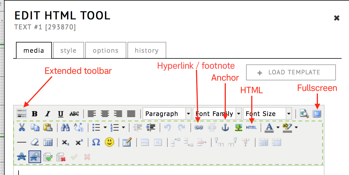
Anchors (Graphical/Block)
You can use the anchor button to insert standard HTML anchors to a specific location in your HTML tool. When creating a hyperlink to your anchor, do not forget to prefix it with a ‘#’. So if you anchor is called “anchor1”, the link should be to “#anchor1”.
Tips Using the HTML Tool:
Make sure the tool size matches the length of the text within. If the text is too long, it will result in scrollbars.
It is possible to insert image or even iframes within an HTML tool, but it is not recommended in most situations. Preferably media is added to the catalogue using the appropriate tools, to avoid the of risk external content going missing when it is removed by the original source. Never copy a media link from a resource in the RC, since it has a timeout.
Be careful making very large texts within a single HTML tool, this may result in unexpected overlap when your exposition is viewed with another browser. 3 or 4 paragraphs per tool is a good average. If you do make a large HTML tool, keep a large margin at the bottom bordor.
You can also choose the colour or the background of the text using the colour tools, insert symbols and tables, and control the edits with the show changes option.
Style
Options
If a text is longer than its frame on the weave, a scrollbar is generated automatically. You can control the visibility of the scrollbar in options. The default setting is automatic. Be careful setting this to never: if a text tool is too small to display all the text, it will be impossible for the reader to see all the text.
Templates
If you want to reuse the content of an HTML-tool, you can create your own templates. This function can be found in the media tab. After finishing the edit of your template, click save as new template and give the template a name in the dialog box that appears. To load a template, click load template and choose one from the list in the dialog box.
Submit, Delete, Or Cancel
Finally, you need to exit the dialog window. If everything is the way you want it, choose submit and the text field will be loaded on the weave. To discard changes to the content, cancel the dialog box. If you want to delete the whole HTML field, including all content in it, click delete. Unintended deletions can be restored via commands – restore deleted tools.
Image Tool
Also known as the picture tool.
To add a picture, drag and drop the image icon from the tool palette onto the weave. As with all other tools, a pop-up dialog appears automatically and gives you the choice between “selecting” or “adding” an item.
You can upload image files in the following formats: jpg, png, tiff, gif, psd, tga, bmp. For uploading PDFs, please use the PDF-tool. At the moment, regardless of the format, the RC will convert the image to a PNG (a lossless format). It’s dimensions will be optimized to the specific use in the tool.
To add an item, choose “add” and upload the object from your desktop to the RC servers. Name the file and make a declaration of the copyright holder. Once an image is uploaded it is also automatically added to the simple media tab.
Warning about .svg files from score programs like Sibelius
Please take care when uploading score .svg files from programs like Sibelius. They may rely on font files (“Helsinki Std”) for the notes that are not embedded in the file itself, which can result in broken display with readers that do not have the fonts available (blank squares instead of notes). As an author you often don’t notice this as the font is installed on your own computer with the software that has created the SVG.
To avoid the problem convert to PNG or use Adobe or Inkscape to make a SVG that encodes the notes as vector glyphs.
https://www.sibelius.com/cgi-bin/helpcenter/chat/chat.pl?com=thread&start=728149&groupid=3&&guest=1
Style
Options
Through the “size” property, you can customize how the image is scaled or stretched inside of its defined box:
- contain : make the image small enough to fit without changing the aspect ratio (default)
- cover : crop part of the image that is not fitting (aspect ratio stays the same)
- fit : stretch the image (aspect ratio changes)
- auto : let the browser decide which part should be cut off
You can also change the position within the border ie: top-left, right-bottom etc…
lock aspect ratio locks width and height of the tool borders. If turned off, you can have a deviating size of the tool, which is useful if you stretch or fit it.
To allow a (smaller) image to be enlarged by the reader: “on click open image in popup”.
If you want to use a picture as a hyperlink, paste a URL into the field on click open link.
Show on hover controls wether to display the copyright when the user hovers (or touches) a tool in your exposition. In addition to copyright, you can also specify a custom caption text “Text On Hover”.

If you want to customize the style of this box, you can use the following “raw” CSS to target it:
#hover pre { /* main body */
  background-color:black;
  font-family: sans-serif;
  font-size: 12px;
}

#hover { /* copyright, if you choose to display it as well */
  background-color:black;
  font-family: sans-serif;
  font-size: 12px;
}
Please note, you can’t change the copyright information in the “edit picture” window. To change the name or the copyright text, close the current dialog and go to the item in simple media and click edit (also double click) to open the edit media dialog.
Audio Tool
As with the other tools, use the audio tool by dragging and dropping the icon from the tool palette onto the weave. A pop-up dialog window appears automatically and gives you the choice between “selecting” or “adding” an item. Selecting is for previously uploaded media (either through other audio tools or the media manager). Adding allows you to upload a new file.
The following formats are supported: ogg, wav, mov, au, mp4 audio container formats; mp2, mp3, aac, pcm a-law, flac audio codec formats. All audio file formats will be transcoded to mp3s with 256kpbs.

To minimize loading times for readers, audio files are automatically compressed. During the transcoding process, the name will be grayed out in the media list and a text will be shown in the preview.
RC encodes with a bitrate of 256 kB per second. For further information and technical questions see FAQ 2.6 or contact the RC User Support.
Style
Options
The audio player has a number of settings:
loop Will loop the playback when it reaches the end of the file.
autoplay The player starts to play back the file as soon as the page has been loaded. Note that this may depend on the readers permissions. If the reader of your exposition blocks autoplay.
stop other players If you are using multiple audio (or video) players on the same weave and your page is quite big, visitors may find it helpful if you prevent overlapping by defining which player is playing. With this option selected, all players (video player, audio player on slideshows, other audio players) will stop when the selected player is playing back. When simultaneous playback is desired, it may be helpful to use the sync-tool.
display minimal When selected, the player consists of only the play button and bar. You can also define some visual player settings. You can hide the whole menu bar or you can set the visibility of the volume or define if you want a player with as few options as possible.
As in the picture tool, if it is necessary to give textual information about the sound file, you can enter the text to be displayed when the mouse cursor hovers over the item.
Video Tool
As with the other tools, you can use the video tool by dragging it from the tool bar and dropping it onto the weave or block. You can then either “add media”: upload it from your local storage, or choose a video that was uploaded before (“select media”).
If you choose “add media”, you will see the dialog below. This dialog contains both a preview and video field. The preview field, which controls the image that is shown before playback, is optional: if you only provide a video, the preview image will be generated from the first frame of the video.
You can later also select different images to function as a preview image. In that case, these images have to be part of your simple media or media sets.

Video Formats and Transcoding
accepted formats
At the moment, the RC supports a large number of file formats. To make sure the video can be viewed by any reader in all browsers and platforms, all video uploads are transcoded to a more portable web-compatible format. This significantly reduces both storage and bandwidth costs (and thereby RC’s environmental impact!) and keeps loading times for readers acceptable.
Since 2025, all videos are transcoded by the Research Catalogue itself using our own local transcoder. In very rare cases, were the local transcoder cannot handle a rare file format, we may rely on a backup external transcoder (Zencoder).
There are a few general limitations though;
- A single file should not be larger than 10Gb.
- It should not have a resolution of above 2048x1080 (2k, 1080p), anything higher will and the transcoding may fail. This is because resolutions like 4k are very CPU intensive to transcode.
- We do not recommend uploading in any raw video format
recommended upload quality
If you have a very large video file (multiple Gb), we recommend compressing it locally before uploading it to the RC.
- max 2k/1080p resolution
- h264 encoder
- mp4 container format
- above average quality setting
Doing this will result in a much faster upload and less waste of storage space on the RC side. There is free and open software that makes this relatively easy (Handbrake, ffmpeg, QuickTime).
transcoded output used in expositions
All videos in expositions are displayed as:
- h264 encoding, in a .mp4 container format
- Max 1080p/2k resolution, for example 1920 × 1080 if the aspect ratio is 16:9. If the aspect ratio deviates, it will be kept, but the resolution is maxed out at 1080p.
- aac audio encoding, equivalent to 160-192kbs mp3
originals in the media repository
The original file is also stored in the RC and available in your media repository. It therefore stays available for download by the author or sharing it as part of a media set. See media repository for more information.
waiting
Transcoding takes time. During the ‘transcoding’ the file name is greyed out in your simple media. If you encounter problems transcoding your files, please contact user support.
Style
Options
The video player has a number of options:
loop Loops the video when it reaches the end.
autoplay The player starts to playback the file when the page is loaded.
stop other players If you are using multiple video players on the same weave and your page is quite big, visitors may find it helpful if you prevent overlapping by defining which player is playing. With this option selected, all players (video player, audio player on slideshows, other audio players) will stop when the selected player is running a file. When simultaneous playback is desired, it may be helpful to use the sync-tool.
display minimal When selected, the player constists of only the play button and the bar.
As in the picture tool, if it is necessary to provide textual information on the video file you can choose to display plain text or copyright information that will appear when the mouse cursor hovers over the item.
You can also use the play tool to synchronize selected video and audio tools.
Slideshow Tool
The slideshow tool allows you to:
- present a series of images that the reader can browse trough
- the slideshow can also be automated, with user defined timing
- each slide can be combined with an audio “background” file [*]
[*] Of course, what you consider “background” may depend on your intented use: you can also use the slideshow as an audio playlist/sequencer and consider the images “background”, for example by selecting transparant images.
Slides tab
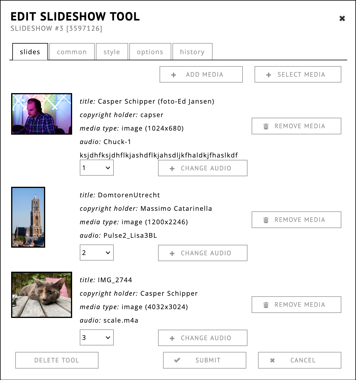
After adding a slideshow tool, open the slides tab to select the images. You can either upload an image from your disk, by clicking add media, or you can select images from your media repository sets and simple media clicking select media.
Each image can also be joined with an audio recording, which will be played in the background. Only audio files that have been previously uploaded to your simple media or in a media repository set can be selected to be used as background.
Style
Options
The options tab contains several sections to control aspects of the slideshow:
Position provides similar options as the image tool.
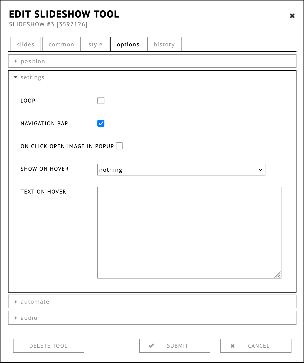
In settings it is possible to choose to loop the slideshow. Navigation bar allows you to show or hide the navigation buttons. On click open image in popup, show on hover and text on hover work the same as in the image tool.
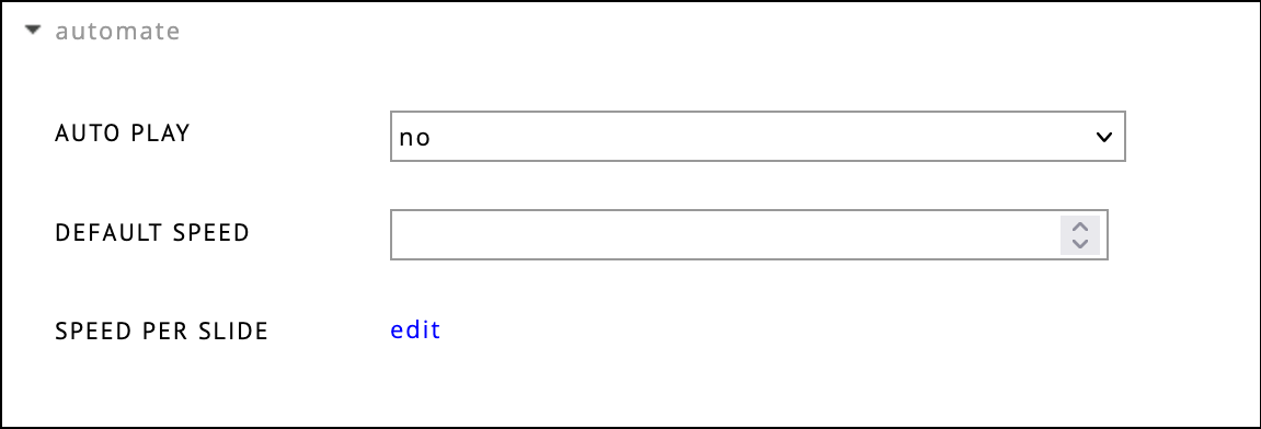
In automate you can set the autoplay options to:
- run after click : run automatically after the first click
- autoplay : after loading the page
By default, users have to click the arrows to switch between slides. When choosing autoplay, you need to define the speed with which the slide will change. You can either set a default speed, or define a speed per slide.
If you set the “speed per slide” to match the duration of the audio files you use, you can use the slideshow tool as a playlist.
As mentioned before, you can append audio files to each slide. Please note, you first have to upload the file into your simple media folder. In options, audio you can control the time of a crossfade (when one audio file fades out while a second fades in at a specified time). You can also choose the fade duration and the timeout of an audio file.
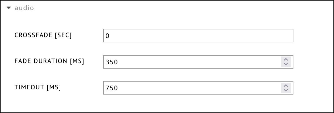
Here you can set a few extra properties for fade duration, crossfade and timeout between the audio fragments.
PDF Tool
The PDF tool gives you the possibility to add PDF documents containing texts, graphics or scores. By default the PDF is displayed as a small thumbnail showing a miniture of the first page. The reader of your exposition can load this PDF in a new tab by clicking the thumbnail. Alternatively, you can set the tool to display the PDF content directly embedded in the page (see options).
PDF is a suitable format for uploading (paper) based documents into your exposition. The limitation is that PDF files, by nature, only support static (printable) graphics and text, not video or audio. Although Abobe has started to support rich media embedding in their own PDF viewers, there is almost no support for this in other PDF viewers (like the one in browsers). In case text from a word processor needs to be combined with video and audio, use the HTML tool for the text and add the media separately using the other tools.
Uploading a pdf
After dragging the icon to the weave, a dialog will show.
Click the button ADD MEDIA to open the dialog for
uploading a PDF.
Be sure to upload the PDF itself in the PDF field, not
PREVIEW. One is also requested to add copyright
information. When done, click submit and the file will begin
uploading.

The PREVIEW field is for changing the image that represents the pdf in the exposition for the reader. If no preview image is provided, a miniturised copy of the first page will be used. You can later change the preview image, by selecting one from your media list.
Changing the PDF Preview Image
If you have an existing PDF tool, you can update the preview image with any image from your media list. If you want to use a completely new image, you will have to add it to your media list first.
- Double click the tool
- Click the “change preview image” button
- Select the image from the dropdown list
- Submit
A Few Notes
Display in browser option is only available in the graphical editor.
! Never re-use the url of the pdf file that opens when you click the pdf tool in the preview. For example: “https://media.researchcatalogue.net/rc/master/73723.pdf?t=2629205589&e=1510816850” These (timed) links are automatically generated by the PDF tool specifically for the user that views the tool and are automatically invalidated after use.
On iOS devices, rotated PDF tools will not open when touched.
Options
Position
The position options (size, position) are only there for legacy reasons. Likely to be removed in future versions of the editor.
Settings
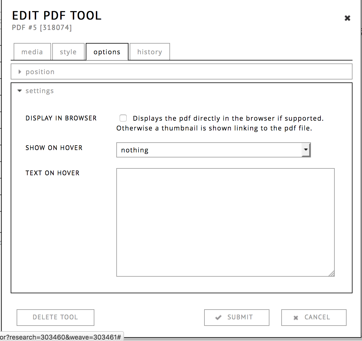
display in browser
This option is only available in the graphical editor! This embeds the PDF contents directly in the page, using the built-in browser viewer.
- use sparingly: placing an embedded pdf (with scrollbars) in a crowded page is disorienting. Better to use this in its own page, with only minimal navigation and additional materials.
- do not place tools on top of an embedded PDF, due to differences in browsers, the relative spacing within your PDF and the tools in RC may get out of sync.
- always check with the preview how the PDF looks embedded.
show on hover & text on hoover
As in the picture tool, you can set a text that the reader sees when they hover the object. To do this, select one of the options in the “show on hover” pull-down menu. You can create a plain text to be displayed when the reader’s mouse hovers over the PDF preview. To use this, choose “plain text” or “copyright & plain text” from the pull-down menu and write your text in the text field below.
Sync Tool
this was previously sometimes referred to as the “play tool”
The Sync Tool is designed to synchronize the playback of selected video and audio tools on the same page. You connect one or more tools to the sync tool, and the tool itself is a button that allows the reader to start and stop playback of all connected tools at once, with one click. This can, for example, be used to document video installations with multiple screens and allows playing back synchronized combinations of musical voices and audio tracks.
Media
The Sync Tool itself functions as the start/stop button, but you have to upload your own icons or images in the tool’s Media tab to make it visible. One is for the “play” state, starting the playback. The other image represents stopping the playback (in all connected tools).
Options
In the options tab you can sellect which tools need to be connected to this Sync Tool. Only tools already present in the current weave may be selected. The option “pause other players when playing” will ensure that only the selected media files will be played back.
Shape Tool
(Not available in the block editor)
The Shape tool is designed for placing simple graphic elements such as arrows and lines in your exposition. You can generate forms to structure your layout or to help navigation. You can create rectangles, circles and lines. You can choose if they’re filled or not. You also have the possibility to specify the thickness of the frame and control the opacity of the elements. There are also four types of arrows (left, right, up, down). You can resize the elements on the weave by resizing the green frame displayed around the shape. By clicking and dragging the yellow point you can rotate an element.
Note Tool
(Not available in the block editor)
The note tool allows you to organize your work on RC, comment on sections, and communicate with co-authors. Drag the note icon from the tool-pallett onto the weave. You can write directly into the note without opening a new edit-window. Each note has a time-stamp which is generated when the note is placed on the weave.
It is possible to define who is responsible for the content (a change or revision, correction) of the note and you can set a date for resolving the issue described in the note.
Notes are visible on the preview as well. Please check, that all notes have been removed from the exposition when you intend to share or publish it.
Notes and User Roles
If an exposition is submitted to a portal the notes created by the different users involved (authors, portal admins, editor, reviewers) have different visibilities. Notes left by the author are visible to the admin and to the editor. Notes left by the reviewer are visible to the admin (though not the author or editor) and notes left to the editor are visible to the author and admin (though not to the review).
Text Style Options
You can use the buttons to directly add the basic stylings, eg. highlight it with bold or italic font or structure it with numerations or lists. You can change the font-family and increase or decrease the indentation. You can also insert links.
History
“History” provides a log of all changes that have been made to the tool. If you have unintentionally deleted a tool, you can restore it using “restore deleted tools” in the commands.
Embed tool
(Not available in the block editor, see alternative methode here)
The embed tool allows the integration of external content, such as videos or sounds, into RC expositions. Currently, the RC supports the following external content providers: Madek, Youtube, Vimeo, Soundcloud and Sketchfab.
If you need to embed an external video into a block page, you cannot use the embed tool. However you can still embed a youtube iframe manually, by adding an html tool, open the extended toolbar, choose “show html source” which is the button with HTML on it and pasting the iframe embed code from youtube.
Embedding Risks
When considering embedding content from external sources, it’s essential to understand the potential risks involved. Here are some key points to consider:
Trust and Reliability: When you use the embed tool, you are placing a significant amount of trust in the external site to maintain and provide access to that content. However, this trust is not always warranted, as external services can change their policies or remove content at any time, especially in the long run.
Content Removal Risks: Platforms like YouTube and others have policies that may lead to the removal of content without prior notice. For instance, videos might be taken down due to copyright claims, policy violations, or other reasons that are beyond your control.
Long-Term Availability: If your content is meant to be published permanently, relying heavily on external embeddings can be risky. Once embedded content is removed or altered, it leaves gaps in your work, which can detract from the quality and reliability of your publication.
Recommendation: To ensure the longevity and integrity of your content, it’s advisable to limit the use of external embedding, especially for key elements. Whenever possible, use internally hosted media or obtain the necessary permissions to host content directly in your exposition.
The embed tool can be used by pasting the link from the page you want to embed in the URL field and clicking submit twice. The first submit initiates the processing of the link. How to retrieve the correct embedding link depends on the service. The main URL visible when opening the media content that is to be embedded can be used by the RC for the above mentioned services. Please contact support if you have trouble or questions regarding the necessary URL.
Content from Youtube and Soundcloud can be used in the play tool and the playback can be synchronized with native RC tools.
Content from Madek needs to have been made publicly visible before embedding is possible. Please copy the sharing link from Madek into the URL field of the embed tool.
Important: Some RC-based journals/portals do not allow the use of externally hosted materials. If you are making an exposition to be published in such a portal, please check their policy first.
Embedding in block editor
The embed tool is not available in the block editor. However, you can still embed content using the HTML tool.
This will work best in single column layout.
- Fetch the embed code from the platform of your choice. For example, in YouTube, you can click the “share” button, and click <> embed to get a code that looks like this:
Example embed code:
<iframe width="560" height="315" src="https://www.youtube.com/embed/oxm8ph2tfpY?si=bXDl1iR8cxAmuEjX" title="YouTube video player" frameborder="0" allow="accelerometer; autoplay; clipboard-write; encrypted-media; gyroscope; picture-in-picture; web-share" referrerpolicy="strict-origin-when-cross-origin" allowfullscreen></iframe>- Add a new HTML tool in your block page
- Make sure the extended toolbar is open

- Click HTML button, to view the source
- Paste the complete
<iframe src..embed code - Close this box, submit the changes
- Check preview to confirm it works
Style Options

The style tab allows you to set the way a tool looks on the outside. There are two ways of reaching the style tab:
- hoovering with your mouse over the tool
- click ☰ -> edit.
- open style tab in the dialog.
For all tools except the simple text tool, one can also open style:
- by double clicking on a tool in the editor
- click style in the tabbar
Click on the small “>” to open one of these sections:
- position
- left & top : set the position of the tool in pixels.
- width & height : set the dimensions of the tool in pixels. Image, pdf, video, audio tools will keep their aspect ratio fixed.
- rotation : set the overal rotation of the tool. You can also change the rotation in the editor directly by dragging it by its yellow dot.
- padding : this adds spacing inside of the border box defined by width and height. This means adding padding will not increase the size of the tool.
- border : make the border defined by width and height visible.
- shadow : this creates a shadow behind the box
defined by width & height. This
can be used to create the illusion of depth.
- margin-left & margin-right : this will set the size off the solid part of the shadow.
- unschaerfe : this will set how wide the fuzzy part of the shadow is. You can also use this when margins are 0, resulting in a completely fuzzy shadow around the object.
- color : set the color of the shadow.
- opacity : smaller values will make the tool more transparent.
- css : set one or more custom CSS classes that can be used trough raw CSS tab on page or exposition level
The style tab only sets the external style of the tool, text markup is done within the text or html tools.
Tool Defaults
It is possible to change the default styling settings for any tool, by double clicking the tool in the toolbar. After the default is changed, every newly created tool will initially use these new settings.
History
The history tab gives you the posibility to change the content within the tool to an older version. The versions of a text object are created each time you have clicked outside it (and the three animated dots show inside). With the html tool, a version is created each time you click submit.
Content Manager / Tabs
The content manager is a collection of tabs located on the right side of the graphical & block editors. It is not present in the text-based editor.

| Tab | Function: |
|---|---|
| map | map and list overview |
| media | view previously uploaded media files |
| popup | manage popovers |
| ref | manage references / bibliography |
| pages | manage pages |
Map
You can use the overview to see all objects in the exposition as both a miniature map and a list. This can also be useful to retrieve lost objects, or change the ordering (front to back). If you click on a tool in the list, the editor will automatically jump to its location, you can also double click a tool to edit the content of that tool.
Media Tab
Media files can be found, uploaded, previewed and deleted in the “Media”-tab on the right hand side. There are subtabs: Simple Media, Sets and “+”, which allows the integration of external repositories, such as the Media Archive of the Arts of the ZHdK (Madek).
Simple Media
The simple media, which can be found within the “Media”-tab on right hand side of the editor. Images, videos, audio and other media that have been added in tools onto the canvas will automatically show up in simple media tab. You can click and drag files from the simple media tab onto your canvas in order to create tools.
You can also upload media here to use it as a background or preview image in tools like the video tool and the pdf tool.
The list of media files can be sorted by type, name, creation date and size and you can search for a file name by using the search field.
Files that are listed in gray are in the process of being transcoded.
There four buttons on top of the list of files, from left to right:

- Upload a file
- Preview a file
- Edit meta-data of the file
- Permanently delete a file from the RC (use with care)
Each media file can be provided with a license, see licenses. The licenses of all used media in an exposition are shown on the META page.
Sets
You can view the media sets you created in the Media Repository. You have to click on the set to open and view the media. Once opened, you can drag media onto your page. An icon will indicate if the set is shared to you by others.
Works
“Works” are an older feature similar to media sets, if you had created works in the past you will find them under sets as well.
Import Word documents using Simple Media
It is possible to upload Microsoft Word (.docx), Libre Office, Open Office (.odt) and LaTeX documents and have the content automatically turned into RC HTML tools and image tools. The RC uses pandoc for this.
To convert a document, open the Simple Media Tab and upload it in the “document” section of the upload dialog. It may take a few moments to convert after the upload has reached 100%.


To ensure maximum compatibility with RC fonts and styling, all word specific styling is filtered, but the inner structure of the text is maintained. This includes: paragraphs, headers, bold, italics, footnotes, illustrations & tables. Footnotes are also converted into RC Footnotes/Popovers.
Once converted, the document will show up as a folder in your simple media. You can drag the elements from this folder to a desired location in the exposition, resize and further adjust them. The document will be split whevever there is an image and the images will become available as image tools.
If you want to reproduce the feel of a text document in your RC exposition, it is best to use the block editor. When importing word content in the graphical editor, please be careful with long text tools (which may cause issues).
Important Note Regarding Styling:
By default, RC has zero margin on all paragraphs, this will mean that there is no whitespace between paragraphs. To avoid this issue, I recommend adding the following style to your raw CSS settings of your page where you import word content. You can edit the “raw css” of a page by opening pages tab > ✎ edit settings > style > raw css.
#container-weave .html-text-editor-content p {
    margin: 1em 0; /* set top and bottom margin to 1 */ }

#container-editor .html-text-editor-content p {
    margin: 1em 0; /* do the same for the editor */ }
This makes sure paragraph margins are displayed correctly.
Pages
Pages are managed in the pages tab of the content manager. An RC exposition can consist of one or more pages. A new exposition starts with a single page, called “default page”.

Creating a Page
New pages are by default private, they have to be explicitely added to the table of content to be visible (or by making a hyperlink to the page in your own content). The order of pages cannot be changed in the pages list, but this can be done in the table of contents. The exposition page will automatically change size based on the content.
Entry page
One can change the first page visible to the reader by changing the entry page. This is the page they see when they open the exposition through “open exposition” or through a DOI. Go to the menu options and choose edit table of contents, and select a page in the dropdown ENTRY PAGE.
Page Settings

In the page settings dialog, you can change the meta data of the page and control the page appearance. It is opened by clicking the pencil button in the bar.
Page Settings - Metadata
Page title Set a title for the page. This title can be overridden in the table of content, so the reader sees a different one. This can be useful if you need to keep track of different versions of pages.
Description The description is for personal reference and only visible to the author and collaborators on the exposition.
Iframe field Replace the entire page by an external website by means of a URL. There are a few requirements to the URL for this to work:
- For reasons of security, the website needs to be configured to use a TLS connection. Links with TLS enabled can in most cases be identified by the https:// instead of http:// at the start.
- You need to provide the full URL (inlude the https:// at the start).
Please note that if a correct iFrame url is provided, the entire weave within the exposition is replaced by that website, so any tools and page styling present in the workspace will no longer be visible to the reader.
If you want to combine external content with tools you should use the embed tool.
Page Settings - Style
Here one can change:
- margin: If set, it will make the exposition as if seen through a smaller window.
- padding: Pad extra space on the content itself (for example if you set top and left to 100, it will create extra space on the top and left). In other words, this makes the exposition canvas itself larger.
- background: Change the color or set an image as background.
- links: Change the default color for all hyperlinks within the page. One can set seperate colors for links the user visited.
- footnote: The color of footnote/popover links works the same way as with links, but for links of footnotes/popovers.
- raw css: apply your own CSS rules to the page, see below
Raw CSS
You can set user defined CSS rules that are applied to the page or the exposition as a whole. Cascading Style Sheets are the standard way of styling HTML documents. Although a lot of styling can be directly edited through the style tab, it can sometimes be useful to specify your own CSS.
The CSS class for HTML tools is:
.html-text-editor-content {
/* put your styles here */
}
To style text within a simple text tool you have to use:
.tool-simpletext .tool-content * {
/* put your style here */
}
Supplying Your own Fonts
As fonts can be vectors for hacks, the research catalogue only allows including external fonts from Google Fonts at the moment (although we hope to change this in the future). Google Fonts has an overview of fonts that you can freely use. You can include Google Fonts through CSS @import statements. Here is an example of using the “Roboto” font:
@import url('https://fonts.googleapis.com/css2?family=Roboto:ital@1&display=swap');

.html-text-editor-content * {
    font-family: roboto;
}

.tool-simpletext .tool-content * {
    font-family: roboto;
}
Line-Height
There is no way to control line height within the HTML or text tool, but you can change it using CSS:
.html-text-editor-content * {
    line-height: 2em;
}

.tool-simpletext .tool-content * {
    line-height: 2em;
}
“em” is a relative size unit, it measures the line-height ratio from the size of the ‘m’ character in the font.
Be aware that changing the CSS
Deleting a Page
The page can be deleted by clicking the trashcan icon next to the page title. Deleted pages can be recovered throught the options menu > restore deleted pages, but only for 30 days within deletion. Of course, if you want to make a page invisible to the reader it may be prefered to just remove it from the table of content.
Popovers
Naming: As of June, 2026, this feature is officially named “popover”,

Popovers provide a way to present additional content in your graphical and block pages without cluttering the page. Popovers thus serve a purpose very similar to that of numbered footnotes in books, without the inconvenience of the reader having to look up the number, it appears directly in context. A popover can be configured to open on click or when the reader hovers it. You can either link the popover to a piece of text, or an image tool. An advantage of opening on click is that it works better on touch devices.
The content of a popup is edited in the same way as graphical pages, and its size and position can be customized as well.
A common use in the past for popovers was to make bibliographical references that pop up in the text. However, the RC also has a dedicated reference feature for that now, that will also generate a bibliographical list on the metadata page.
Creating a Popover
Popovers can be created in two ways:
- Inside of the HTML tool
- Linked to an image tool
To create a popover within a text tool, open a HTML
tool and select a piece of text. After this, click the popover
button  ,
this will open a dialog:
,
this will open a dialog:

Now choose the second tab “footnote” to create a new popover.
To link a popover to an image tool, right click the image tool and select “add popover”.
Customizing the Popover Properties
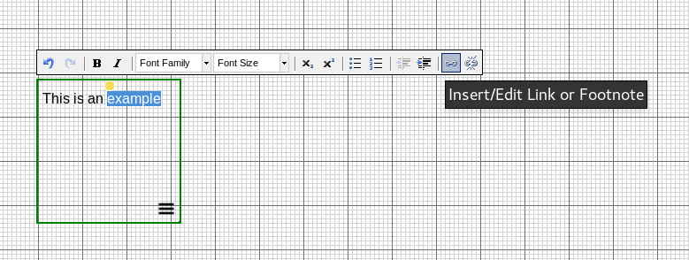
You can customize the popover by setting the following properties:
- The title of the popover.
- Whether the popover will be shown when the link is clicked or on mouseover (“View on”).
- Where the popover will be displayed with reference to the link or the screen in case of the last option (“screen center”).
- Whether the background (i.e. the rest of the exposition) will be darkened when the popover is being shown.
- The type of the popover. This can be:
- A new popover.
- The copy of an existing popover.
- A simple text popover. A small text box appears which facilitates
the creation of popovers containing only a short amount of text. The
text can be entered here directly upon creation without the need to
further edit the popover and adjust its size.
Editing a Popover
All popovers are listed in the “Popups” tab on the right hand side. If you click one, the RC will automatically scroll to it’s reference in the text or image tool.
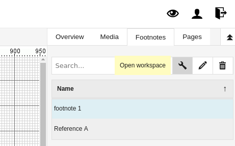
The list has the following actions:
| Icon | Function |
|---|---|
|
opens the popover workspace editor where you can edit thecontent of the popover |
|
opens a window which allows editing the title, size, and styling of the footnote. |
|
delete a footnote |
The popover’s content is edited using the graphical editor mode. There is one important difference: the popover canvas has a specific size which can be set by dragging the right-bottom corner:

Tip: popovers work best if kept small: when they reach the limits of the screen they get hard to work with for the reader. Be sure to test your popovers for best results.
“simple text” popovers are in fact automatically generated normal popovers with your text inserted in a text tool. This has consequences if you want to adjust the size of a “simple text” popover as a whole, since you would also need to change the size of the tool within that popover after resizing. To edit a “simple text” popover internal tools, simply double click it in the popover list.
Changing the Position or Display Settings of a Footnote
If you need to change the screen position or display settings of an existing footnote, the best way is:
- Go to the Footnote tab.
- Click the footnote you want to change.
- Click Edit Settings (“pen”) icon.
- Go to the options tab.
Auto-Numbered Popovers
Instead of using text as popover links it is also possible to use automatically numbered links, more like traditional numbered footnotes. This works best in the block editor. The numbers will be filled in and adjusted automatically if you reorder your content, based on position. In order to create auto-numbered Popovers create a popover in the text or HTML tool as described above but without selecting any text. An “x” will be inserted where the cursor is placed. This “x” will be replaced by the correct number when the text is displayed.
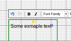
The numbering starts at 1 and encompasses all text and HTML objects on the weave. Numbering is performed by object and proceeds from the top and left to the bottom and right of the page.
Be aware that automatic numbering does not depend on creation order, it only depends on x and y position of the tools. This means that if the notes (1,2,3 etc..) are in a vertical column, for example:

When the tools are lined up like this, popover are correctly numbered. However, if one of the text tools containing an automatic footnote in a column is just a bit (even 1 pixel) to the left, like so (exaggeration):

Then RC will automatically number the notes in 2 first, then 1, then 3. In this case, it is very important to have the text tools exactly at the same x position (through right click -> style tab you can check this most easily).
Pictures
It is also possible to use an image as “trigger zone” for a popover. When clicking on the image or moving over it with the mouse cursor the popover will be show. In order to link an image to a popover click the menu icon on the bottom right of the image (or right click the image) in order to open the context menu. Click the item “add popover” from the context menu and fill in the appearing dialog window.
References
The reference feature allows you to build a bibliography for your exposition. It is available for both graphical and block pages, as an option in the HTML tool.
Creating a Reference
You can create a new reference by going to the Ref tab, which is located on the right-hand side of the workspace editor. Click the + button to create a new reference. A dialog will open with a form to enter the reference data.

Alternatively you can also import references from external managers (for example: Zotero, Menderley & Jabref). The format used is BibTeX. You can also import multiple reference items in one go.
The RC currently supports the following reference types:
- Book
- Chapter (of a book)
- Journal (article)
- Website
- Master Thesis
- Phd Thesis
- Proceedings
- Video
- Score
- Artwork
- Recording
- Exposition
- Misc
Each item will have different fields. Fields marked with * are required. In case none of the types fit, you may choose to use Misc, which stands for miscellaneous.

Inserting a Hyperlink to Reference in Bibliography
In the HTML tool, there is a button which allows you to insert a direct link to a reference in your bibliography. The reference will both show on hover and when the user clicks, one can view the full bibliography.

By default, this type of link is constructed from the last name of the first author and the year. You can customize the text of the link by selecting it and typing over it, for example to include a page number. The links will use the default hyperlink color, that can be customized in the Page settings page.
Viewing the References
References are listed on the META page of an expostion, at the bottom.
Table of Content
See the video tutorial on this topic.
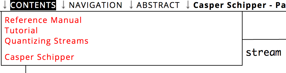
The table of content is designed to facilitate the navigation through an exposition. Both pages and locations within a page can be added in the table of content. You can also set an entry page, this is the page where the user starts reading. In order to edit the table of content, go to the “Options” menu > “Edit Table of Content”.
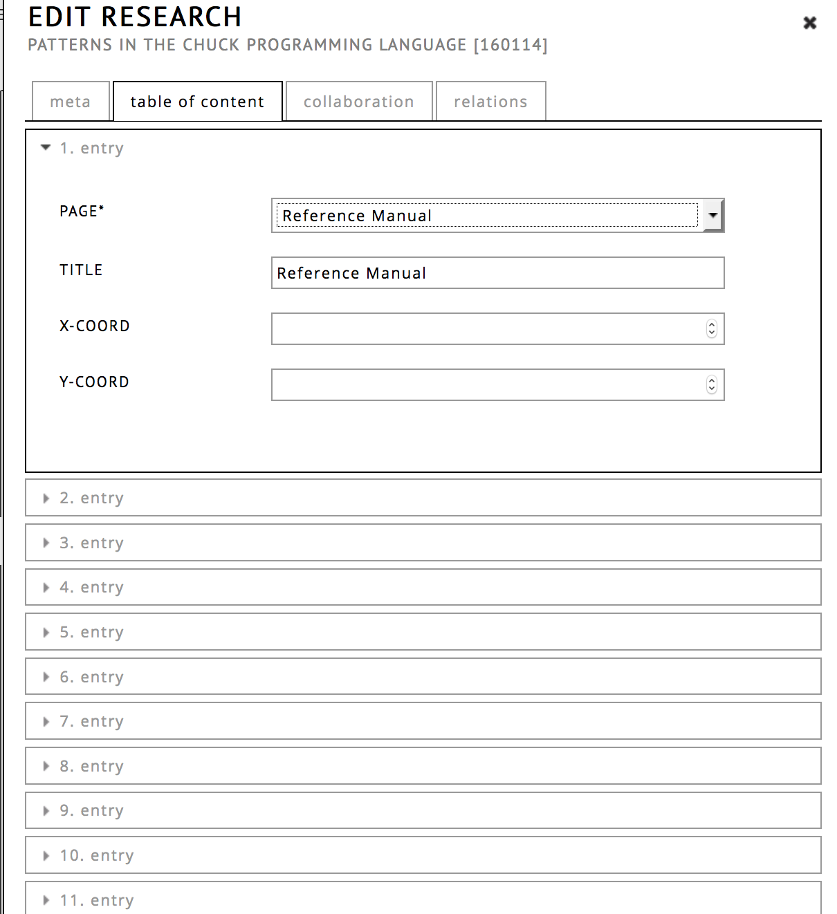
To make a new entry, click on the index number and select the page (or “weave”) from the drop down menu and click submit.
There are two optional fields:
Title
Specify a custom name for this entry to be used within the contents menu. If left empty, it uses the title from the editor.Tool
You can use a tool coordinates as an entry point. You will be provided with the list of tools in the exposition. This also means if you later change the tool position, this entry will still point to the same tool. It is recommended to name the intended tools in a clear way, so you can better find them from the list.X-COORD & Y-COORD
you can use this to create an entry that has an offset, which immediately opens the page on a specific location within the exposition. The X,Y values correspond to an offset in pixels. The Y offset is measured from the top. Instead of looking these values up by hand, you may also use options -> show current position.
Tip: you can reorder the table of contents entries by clicking and dragging them using the ☰ icon
Static Navigation Bar
At the bottom of the table of content dialog, there is an option static menu bar to display the navigation bar continuously (instead of automatically hiding it).
TOC Alignment
Choose whether the links in the content menu should be displayed horizontally or vertically.
Hyperlinking
See the video tutorial on this topic.
It is possible to create hyperlinks between pages (or “weaves”) of an exposition and within a single page. This process has two steps:
- Fetch a link to a position or tool you want to link to.
- Insert the hyperlink within text, or attach the link to an image tool.
In order to fetch a link to a different page within your exposition:
Open the page you want to link to in the editor (through the page tab on the right hand side).
(optional) scroll the page to the position where you want the link to point to.
Right click any tool you want to link to and click “copy tool link”.

In the graphical editor it is also possible to create a link that points to your current (absolute) position in the editor. To fetch such a “position link”, use the menu options > show current position and copy the url.
To use the hyperlink in your text:
- Create or open a Text or HTML tool and select a word or sentence that should become the link.
- Now click the hyperlink button (it looks like a chain link) and a
dialog will be displayed.
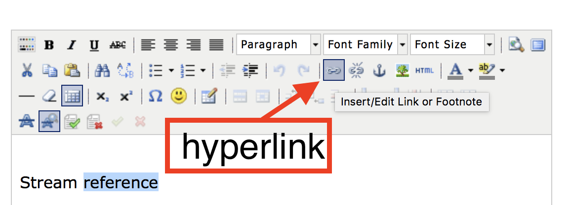
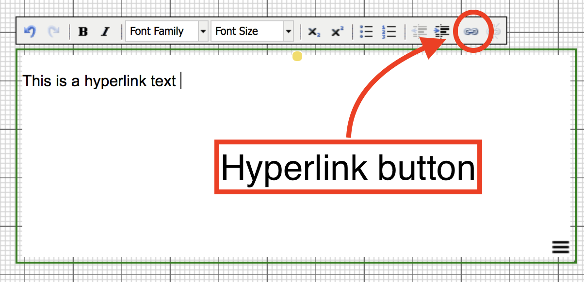
- Paste the link in the link URL field and click add link.
Optionally you can change the target property, to have the link open in a new window. Note that if you have not selected any text, the link dialog will not offer a hyperlink option.
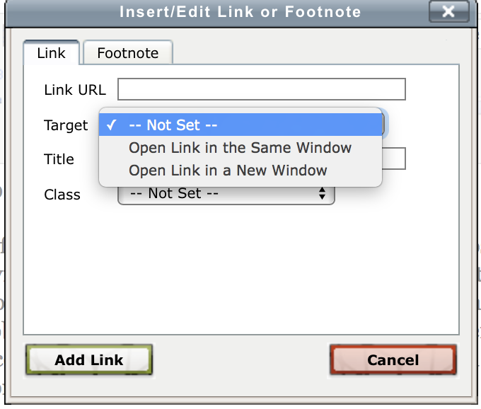
Dialog Options:
Within the hyperlink dialog there are a couple of options:
- Link URL : here you can type or paste a link
- Target : control whether the link will open in a new screen or not.
- Title : change the title of the link
- Class : set the class of the link (this is rarely used)
Overview
Within the “Overview” tab on the right-hand side of the editor there is a checkbox labeled “Overview.” Clicking the checkbox will open and close a tab on the right-hand side of the editor. It contains both a map and a list of all objects in the exposition.
The overview map outlines all tools on the page, their size and position. By moving the red rectangle, one can jump to a specific position on the page.
Below the overview map, there is a list of all objects. If you click one of these tools, you go directly to that tool’s location. This can also be very useful when trying to find tools that have somehow become hidden, for example if another tool has been placed on top.
Other Menus
Edit Menu
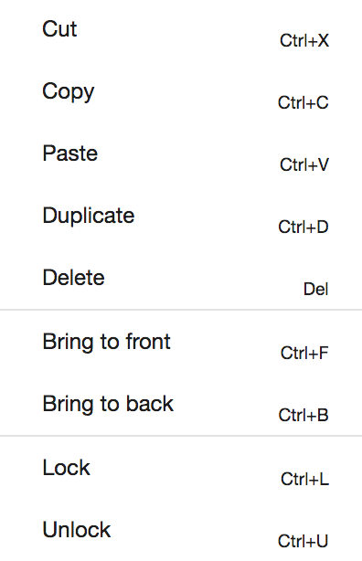
Trivial copy paste functions:
- cut - ctrl + K
- copy - ctrl + C
- paste - ctrl + V
- duplicate - ctrl + D
- delete - delete (Apple: fn + backspace) (ctrl = cmd on Mac computers)
Order functions:
- bring to front
- bring to back
These options change the order of objects if they overlap. Order can be important if you have tools with controls: for example, an audio player that is behind a text tool would need to be in front to allow the user to click the play button on it.
Locking:
- lock
- unlock
Locking an object means it cannot be changed or moved in any way (until it is unlocked). This feature can also be used if only part of the exposition is to be moved (by locking the objects you do not want to move).
Arrange Menu
These functions help with aligning (two or more) tools. To select multiple tools, click them one by one while holding ctrl/cmd key, then choose the function you want to apply from the arrange menu.
(!) Be careful when applying changes to many tools at once on a complex weave. The changes in position are not reversable (unless you copied the tools before).
- left edges: all left sides will be aligned (to the last tool you selected)
- right edges: all right sides will be aligned
- top : all top sides will be aligned
- bottom : all bottom sides will be aligned
- center on vertical axis : the tools will all be centered around one vertical line (like centered text !)
- center on horizontal axis : the horizontal middle of the tools will al be on the same horizontal line
- distribute left edges equally: the left and rightmost tool stay in the same place, equally space the left sides of the tools in between
- distribute top edges equally: the top and bottom tool stay the same, equally space the top sides of the tools in between
- make vertical gaps equal: the gaps between tools are all made the same (by dividing the sum of gaps equally)
- make horizontal gaps equal: the horizontal gaps between tools are made equal.
Options Menu
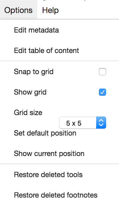
Edit Metadata
Here you can edit the Title, Abstract and Entry Page of the exposition.
Show Tool Borders
When this option is turned on, you will be able to see all borders of all tools (green dashed line) in the editor. This can be helpful searching for empty tools.
Edit Table of Content
Here you can set the contents of the “contents menu” that the reader uses to navigate between pages and position in your exposition.
See table of content.
Grid Options
- Snap to grid
Objects will only move in grid-size steps
- Show Grid
Show/hide the grid
- Grid size
Change the size of the grid
Set Default Position
Change the initial position that the reader starts at in the weave, to the current location of the editor view.
Show Current Position
This provides the X,Y offset of the editor and a position link. X,Y can be used in the Table of content. The position link in Hyperlinking, or simply to share a specific position through a position link.
Restore Deleted Tools
Restore recently deleted tools. Currently, this option is only available in the graphical editor mode.
Restore Deleted Footnotes
Restore recently deleted footnotes. Currently, this option is only available in the graphical editor mode.
Help Menu
Get help!
- this guide
- the forum
- the video tutorials
Send Collaboration Message
When you are collaborating on an exposition, you can use the command “send collaboration message” to communicate with your collaborators.
Fonts
The research catalogue currently provides the following fonts:
Sans-serif:
- Anton (similar to Impact)
- Nimbus Sans L (similar to Helvetica)
- Arimo (similar to Arial)
- Carlito (similar to Calibri)
- Open Sans
- Lato
- PT Sans (used in the Research Catalogue logo)
- Roboto
Serif:
- Crimson Pro
- Libre Baskerville
- Merriweather
Monospace:
- Courier Prime
- IBM Plex Mono
- Roboto Mono

If you have an older exposition (created before April, 2022), you will also be able to select additional fonts. The reason for this is that Research Catalogue used to allow users to select these in the past. A majority of these fonts were only available in Windows and/or MacOS. The licensing around these proprietory fonts prevented Research Catalogue from self-hosting them. When a font was not available locally, the browser would switch to an alternative and this resulted in smaller or bigger visual differences and a warning message to the user.
The current solution to this problem is that Research Catalogue now provides a set of fonts that we can host ourselves. This guarentees that a font chosen in the text & html tools can never be missing. To ease the switch, we have included replacements that are designed to closely match the common fonts like Arial, Calibri and Helvetica and Impact. Older expositions will keep their current fonts but allow you to also use the new ones. Published expositions expositions cannot be changed, but you can create a new version of the exposition.
Migration of fonts in your expositions
In existing expositions (that have not been published), you can replace all current fonts to using the RC-safe set. One way would be to do this by hand, but for convenience we also provide an automatic option.
If you have a simple exposition, it is recommended to first do some small test switching the font in a selection of tools within your exposition by hand. If you like the result, you can then use the migration option, which can be found in the menu: Options > Edit metadata > compatibility. Due to technical limitations, this option is not available if the exposition is “in revision” or “in review”. If you want to apply the font migration to an exposition in such state, please follow the instructions “Safely trying a migration” below.
The font compatibility dialog will automatically detect which fonts are used in your exposition. You will then be asked to select a replacement font for each one.
Safely trying a migration:
If you have a very complex exposition with many tools, we highly recommend to first try the font migration on a copy instead of the original exposition (!). You can make a copy by:
- go to your profile page
- click the ☰ -> “manage versions” option on the exposition
- create a snapshot
- restore the snapshot, this will appear as a separate exposition on your profile.
- open ☰ -> edit workspace, and go to options > Edit metadata > compatibility to apply the migration.
If you do not like the result, you can just delete the exposition and start at step 1.
Text Based Editor
First time user of the text editor? click here.
Overview
Click any element in the image to jump to the relevant section:
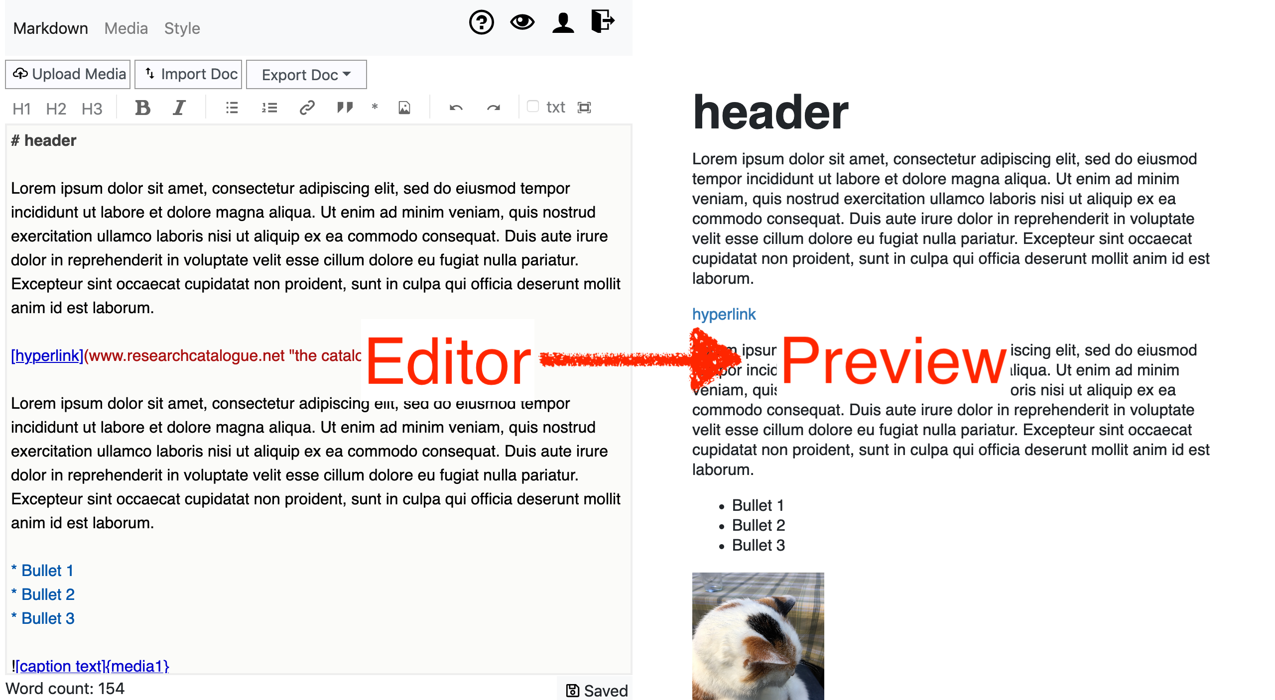
- markdown editor
write and edit your text - preview
preview the result. - media-list
add/remove/edit media.
- import/export import&export to various text formats
- style editor
change the styling (font-size etc..) using CSS
- Upload media
Upload media files (image, video, pdf) and insert in your exposition
Introduction
The text-based editor is aimed at creating responsive RC expositions. Despite the “text” in the name, expositions made with this editor can also contain images, video, audio or PDF. “Text based” refers to the method of editing: through plain text.
Because of this plain text input, text-based expositions can be easily imported or edited in external editors. What you express is the structure of the text instead (paragraphs, headers, figures, emphasis, links, inline media), without specifying the styling yet. To express this structure, one uses Markdown. For styling the text one may use Cascading Style Sheets (CSS).
Advantages:
- You can change the look of an exposition globaly very easily after writing it
- Portable: you can copy and paste the source from and to external editors
- Many programs support converting something into Markdown
- Closer to HTML: you may use HTML directly to do some custom markup or styling
- Responsive by default
- Allows some templating
Disadvantages:
- You cannot style your text while you write it
- Markdown can be a bit counterintuitive, especially with the way it handles newlines, lists and paragraphs
On desktop, the editor splits the screen in two: you can write your text on the left side editor while the result is shown as a preview on the right hand side. It is also possible to import the text from external formats like Word and Open Office. Formatting (bold,italic etc…) is added using markdown notation.
If you want to insert media, you can add these through the “upload media” button . When the upload has finished, the media edit dialog will automatically open, allowing you to edit and insert it.
Finally, the look of your text and media can be controlled through the media list and the style editor.
Creation and Using a Template
To create a text-based exposition, go to “my profile” and click create exposition, then select “text-based” for the editor type. Additionally, you can select a template, which will mean your new exposition will be pre-filled with the stylesheet and, depending on the template, some placeholder text.
Because the text-based and graphical formats are completely different, you can only change the editor type the moment you create a new exposition.
Portal admins can select any of their own expositions to become a template for their portal users, by going to the “template” tab in their portal settings.
Editor
The left hand side is where you can edit your text. The editor uses Markdown, which is a lightweight, human-friendly markup language. Because Markdown is expressed as plain text, you cannot directly change the styling of the text (font-size, color etc.. are edited in style ), but you can express the structure/markup of your text. See Markdown for a brief overview.
By default the editor uses colors to show the Markdown elements in your text, but you can also choose “plain txt” which allows your browsers spellchecker to work. 1.
Pages / Table of Contents
The text based editor is limited to single page articles. Headers
marked with # will be included in the “contents” menu
automatically.
Previews
Here you can see a preview of your exposition.
Because text based expositions are responsive (react to the size of the window), the result may change based on the width of the screen. For a full view preview, use the eye button in the toolbar.
Upload Media
To add new media, click upload media. After the upload finishes, the media edit dialog opens. This allow you to edit its metadata, size and to insert the media at the current cursor position.
If you want to insert previously used media, you can use the “media button” in the toolbar.
Media List
All media that you uploaded will appear in the “media list”, where they can be edited or deleted.

Editing Media
From within the media-list, if you click [edit], you will be able to change the name, metadata and display of a media file.
- name (also used for the tag)
- change the way the files is displayed (size, float left/right)
- add copyright info
- choose a license
- add description
Using the buttons in the list itself: - remove the object from your exposition
- insert the object in the current position in the text.

Insert Media
Media is represented on the editor side using a !{media-name} tag. The easiest way of inserting such a media tag is throught the insert media toolbar button, which shows a list of available media that can be inserted. Double click any item to insert.

You can also write the media tags directly, for example: to insert a media named “myFile”, you can directly write !{myFile}. This !{myFile} tag will be the location in your text where myFile will be inserted.
A caption text can also be included, to get a caption you write ![my caption text]{myFile}. The caption text is displayed underneath the media.
Import & Export
You can import content from documents from text editors like Word (.docx), Libre/Open Office (.odt), HTML and several other formats. Not all styling is supported but images, footnotes, tables and most other structural features of the text are. Best results will be achieved if the document that is imported has a simple structure. When you import a a document, it will not replace the current content, but be appended at the end of your page.
Edit Style
Text based expositions are styled using CSS (Cascading Style Sheets), which is a standard way of styling web documents. The CSS of an exposition can be edited by going to the style tab. If you are not familiar with CSS, there is a good introduction here: https://www.w3schools.com/css/.
The structure of inserted media is as follows. You can use the outside class (rc-media-123455) to style an individual media element.
    <div class="rcobject small [rcimage/rcpdf/rcvideo/rcaudio]rc-media-[media id]">
        <figure id="media-1"> <img src="...">
            <figcaption> Caption text, which is taken from the tag -> ![captiontext]{media1}
            </figcaption>
        </figure>
    </div>
Most templates will provide some basic formatting already, that you can adjust to your needs.
Toolbar
From left to right:
- H1, H2 & H3 - insert header formatting
- B / I - insert bold (strong) and italic (emphasis)
 - Unordered list / bullet
point formatting
- Unordered list / bullet
point formatting - Ordered list / Numbered
list formatting
- Ordered list / Numbered
list formatting - Insert hyperlink
formatting
- Insert hyperlink
formatting - Quotation
- * - Insert footnote notation
 - Insert Media from media list
 - Undo/Redo
- txt - Switch to plain text mode (browser can provide spellchecker in this mode)
 - Fullscreen
mode (hides preview)
- Fullscreen
mode (hides preview)
Markdown
Markdown is a human-friendly way of writing HTML webpages without using code. Markdown is written as plain text (like you would write on a typewriter), that is translated into HTML for you.
By surrounding your words with a few special characters you can inform markdown which styling you want it to use.
For example:
italic = *italic*
bold = __bold__
Instead of typing these characters, you can also select a piece of text and push the desired style button on top of the editor. This will insert the correct Markdown notation for you.
Paragraphs and Newlines
Single newlines are ignored by Markdown, unless:
- are made explicit by adding two spaces
- preceded by the backslash character
“
\” - there are two newlines, which means there is one empty line.
Below are some examples to illustrate the behaviour. In the
input the position of newlines is shown with
⏎.
A single newline character is ignored (!)
input:This text will⏎
be joined together
results in:
This text will be joined together
An empty line will start a new paragraph
If you create an empty line, by hitting enter twice ( ⏎⏎ ) , it will create a new paragraph in the output.
input:
a paragraph some text and some other
text. a paragraph some text and some other
text. a paragraph some text and some other
text. a paragraph some text and some other
a paragraph some text and some other text⏎
⏎
Another paragraph with some text. Another
paragraph with some text. Another paragraph
with some text. Another paragraph with some
text. Another paragraph with some text.⏎
⏎
results in:
a paragraph some text and some other text. a paragraph some text and some other text. a paragraph some text and some other text. a paragraph some text and some other a paragraph some text and some other text text
Another paragraph with some text. Another paragraph with some text. Another paragraph with some text. Another paragraph with some text. Another paragraph with some text.
Two spaces at the end of your line will retain the newline:
input:
This line has two spaces at the end ⏎
and it thus keeps the
newline.
results in:
This line has two spaces at the end
and it thus keeps the newline.
A newline can also be created by ending the line with a “\”:
input:
The same for the backslash\⏎
also does the trick!
results in:
The same for the backslash
also does the trick!
Headers
Headers are defined by using one or more "#" in front of the header name:
# header 1
## header 2
### header 3
There are six levels of headers. Header level 1, 2 and 3
(#,##,###) are automatically
included in the contents menu, for easy navigation for
the reader.
An alternative way of writing headers is by putting ===== or — below you header text.
Header 1
========
Header 2
----------
Lists
To get a bullet point list, write * before each item. Before the first item, keep an empty line. Thus, when you write:
* my first point
* another throught
* yet another thought
it will result in
- a list
- which has
- three items
To get ordered lists, write a number and a point, 1. , 2. , 3.
1. one
2. two
3. three
Links
Hyperlinks are written in the following manner:
[linktext](http://example.com)
which results in:
linktext
You can also use create internal links, called anchors. The link is made by writing a hashtag (#) before the name of your anchor:
[link](#your-anchor-id)
note the ‘#’, without this it will not work!
The anchor (or bookmark) itself is created like this:
<a id="your-anchor-id"></a>
Text-based Footnotes
The easiest way of inserting a footnote is using the footnote button: [ * ]. Footnotes consist of two parts, the reference, written like so:
[^1]
Then you define the footnote content at the bottom of your text with:
[^1]: This is my footnote.
Tips:
You may define a footnote content anywhere in your text, all footnotes will always be rendered at the bottom of your text.
The footnote identifier, does not have to be a number. You can also use names like (
[^fn1]or[^myfootnote]etc..). When the exposition is generated from the markdown, all identifiers are sorted and turned into numbers.
Quotation
A quotation is inserted by indenting your text with 4 spaces or 1 tab, like so:` quotation` ` more quotation`
Quotations are not automatically formatted (they keep their newlines).
Markdown Tables
Tables are written like this:
| Name | Age | Species |
|---------|-----|---------|
| Harry | 23 | Human |
| Gerhard | 77 | Parrot |
| Judith | 6 | Cat |
| Name | Age | Species |
|---|---|---|
| Harry | 23 | Human |
| Gerhard | 77 | Parrot |
| Judith | 6 | Cat |
You may also use HTML tables. There are also online tools that help you generate either of these
HTML Import
It is possible to import a website of static HTML into the RC. This feature is aimed at users that are familiar with HTML and want to use their own editor.
For security reasons, JavaScript is not supported, but CSS files,
<img> <video> <audio> tags can be used.
The folder containing your HTML and media files are to be uploaded as a
single zip file (.zip). The maximum filesize is 10Gb, although for
practical reasons it is probably more convenient to stay well below
this.
Important: at this moment, the existing RC Journals do not accept submissions imported as HTML, because they do not fit in existing reviewing/editing workflows. If you are planning to submit your exposition to one of the journals in the RC, one should use the graphical or the text-based editor.
To create a HTML based exposition:
- Click [ Create Exposition ] on your profile page.
- Select “html based” as the editor, fill in required metadata fields and click submit.

- You will now enter an upload screen, where you can select your zip.

Wait for upload to finish
When the upload finished and there is no error, you can view the exposition by clicking the preview button (eye in the top right corner). If it is not succesful you can use the error message to see what changes you may need to make and try again.
Requirements for HTML Expositions
There are a few requirements to the zip that is uploaded:
- The root folder needs to contain a file named index.html, this will be the page where the exposition opens.
- All other HTML files in the root folder will be added to the table of contents.
- Do not nest folders into folders.
- You can use .html .css and various media formats, mp4, mp3 etc.. The RC will automatically transcode the video and audio to a web compatible format.
- JavaScript is currently not supported for security reasons, if present, import will fail.
- Maximum size is 10Gb.
Character Encoding
The character encoding of the .html files should be UTF-8. You should
specify the character encoding first (before
<title>), for example like so:
<!DOCTYPE html>
<html>
<head>
<meta charset="utf-8">
<title>my exposition</title>
</head>
<body>
etc...
Example Exposition
An example HTML-based exposition for use in the RC can be found on Github:
source: https://github.com/SocietyForArtisticResearch/rc-html-import-example
as zip: https://github.com/SocietyForArtisticResearch/rc-html-import-example/blob/master/DemoExposition.zip
Updating
Currently, it is not possible to update single files within your uploaded exposition. When something changes, you will have to upload the whole exposition again.
Visibility, Collaboration, Sharing and Publication
By default, expositions are private: only visible to your account. These are the three options to make something visible to others:
- collaborate: invite individual RC users to view, comment or edit your exposition.
- share: make your research visible to other people, but you can still change the content or make it private again. Others will not be able to edit. By sharing, the exposition will appear on the front page, your public profile, and search results. You can also connect a shared exposition to a Group or Portal, this way it will appear there as well (as the other locations).
- publishing: self-publish, or request publication within one of the portals. You cannot edit the content after publication.
An important feature of publication in the RC, is that it is permanent. This means that once an exposition is published, content will be locked forever. The idea behind this is that the content of published expositions can be safely referenced by others without risk of linking to something that has changed or disappeared.
Collaborating on Research
The Research Catalogue allows you to work together on a research exposition with one or more users. This is called collaboration.
There are 3 types of collaborators:
- co-author : The collaborator is considered a co-author of the research and will be shown in the author list of the research exposition. They can read and edit all content.
- contributor : This type of collaborator has the same rights but won’t feature as co-author of your exposition. An example of a contributor might be a graphic designer helping with the layout of your exposition without having any involvement with the research itself. They can read and edit all content.
- supervisor : The collaborator can view an exposition and leave comments. A supervisor can only read the content, not edit.
Adding a Collaborator
An author of an exposition can invite collaborators through the collaboration tab of the exposition: click the menu icon (1) and ‘edit details’ (2) next to the research on your profile. If you are already in the workspace editor, you can also use options > edit details to open the same menu.

Choose ‘collaboration’, search for the user you want to cooperate with and add the collaborator by clicking on their name. Only users with full accounts can be collaborated with, and limited accounts will not show up if you try to find them.

The users that were added will show up as a list below the field. After clicking submit, collaborators will receive an invitation from you in their collaboration page.
Accepting a Collaboration Invitation
You can find all collaboration invitations under https://www.researchcatalogue.net/collaboration/list. At the bottom of the list of invitations, you can find the backlog. In the backlog you can easily find all your past collaboration interactions, including links to the expositons & groups that you have been invited to. If you have “collaboration” notifications switched on in your profile settings, you will also recieve an email when somebody invites you.

Removing a Collaborator
If you want to remove a collaborator, click the “x” behind their name in the field they were added.

Note: If a user’s name in the list is enclosed in brackets ( [ name ] ), it means that the invitation is sent successfully, but has not been yet accepted by the receiver.
The owner role
Every exposition has exactly one owner. The owner is one of the author(s), and has some extra capabilities:
- Can delete the exposition.
- Can submit a publication request for the exposition.
- Can request connecting it to a Project or Portal.
Only the owner role can change who is the owner to another of the current collaborators. If the owner role is to be transfered, the owner has to open the collaboration menu and choose another collaborator from the drop down menu:

Be aware that changing this will remove the privileges from the previous owner.
Realtime Collaboration
For pages created with the graphical editor, you will see the edits of the others directly as they are made, in the other editors (block, html or text-based) you will have to refresh your browser tab to see changes. When a tool is being edited by another user, it will get a blue border. When a page is being edited by another user, it will be highlighted in blue.
Communication with Collaborators
While collaborating on an exposition, there are several ways of communicating with each other:
chat In the graphical exposition editor, you can chat with your collaborators.
Using the note tool Notes are the RC equivalent of yellow paper notes. You can simply drag one from the toolbar onto the exposition workspace. See also the note tool help. The note tool currently is not supported in block style pages.
Send collaboration message You can send a direct text message to your collaborator using the Send collaboration message found under the commands_ tab.
Posting a comment In expositions where you are not a collaborator, you can still leave comments by going to the top bar of the exposition and clicking the Comments.
Instead of collaborating with RC users you can also publish an exposition or share share it with groups of people. The difference is when an exposition is shared, content can still be changed, and the mode of sharing can be changed at a later point.
Share
Share option can used to control visibility of works and expositions for groups of people. By default, your expositions are private, changing the mode allows others to see your work. Unlike publishing, you will still be able to change the content of an exposition when it is shared. Share settings can not be changed while the exposition is in review.
The share option can be found under the object menu ( ) of
each object on your profile.
) of
each object on your profile.

There are four modes of sharing:
- private (default) : only visible to you or the collaborators on that specific object.
- only RC users : visible to users with an RC account.
- limited to portal: visible only to members of a certain portal within RC. Clicking a portal in the list below, toggles visibity of your exposition for members of that portal. If required, you can also select multiple.
- public : visible to anyone on the internet.
Independent of the above choices there is a check box:

link share : “When enabled, the object is accessible…” The exposition is accessible through the link displayed next to it, which is not shown anywhere else. This is useful for sharing with readers without an RC account, by turning the option on and mailing them the link.
Tip: Do not forget to submit the form, as the secret link will become active after submitting the form.
Link share can be combined with any of the other sharing modes (private, RC users, limited to portal, public). An exposition can for example be shared within a portal but simultaneously be accessible to some other people through the “secret” link.
Publication
Publication, is permanent. This means that once an exposition is published, all content will be locked. The idea behind this is that the content of published expositions can be safely referenced by others without risk of linking to something that has changed or disappeared. You can self-publish an exposition, or request publication with one of the portals. Please consult the portal pages: (institutions or journals) to see what requirements there are for publication there.
Self-Publish
Self-publishing makes an exposition no longer editable and publicly visible. On publication you will get a (free) DOI. By design, publishing an exposition is not reversible (so others can use the exposition link as a reference).
Submit for Review
Expositions can also be submitted to portals (such as journals) for review and publication. Most of the institutional portals will only accept requests from within the institution that is associated with it. In case you want to submit to an institutional portal, be sure to check their instructions regarding submissions: (institutions or journals).
To request review within a portal, click ☰ -> submit for review. You will be prompted to select to which portal you want to submit. After submitting, the exposition will show “in review” status.
While the exposition is “in review” state it can no longer be edited. The portal admin or editor will contact you regarding the reviewing process. The portal admin can unlock the exposition by putting it “in revision”, or rejecting the publication request. In the first case you or the admin can lock it again, in the second case you will have to resubmit it using the normal method.
After the portal admin accepts the publication request, you will receive a message and the content of the exposition will be premanently locked.
Submitting collaborated expositions
Expositions can only be submitted by the main author or owner of the exposition. So a co-author or contributor cannot submit an exposition for review. See owner.
Connect to Portal
A shared exposition can be connected to a portal. Connecting shared exposition will result in the exposition being listed on the portal page, without locking the content. The important difference with publication is, that connected expositions can still be changed after the connection has been made.
To connect an exposition, the main author will have to use the ☰ -> “connect to” option to request connection.
There are two conditions that need to be met before a request can be made:
- The main author has to be a member of the portal.
- The exposition cannot be private (it has to be at least shared within the portal, or public).
The portal admin will receive a notification and has to confirm the connection (portal-admin documentation).
Once the connection has been approved by the portal admin, the connection will be shown in the expositions metadata and the exposition may appear on the portal page and portal feeds. Connected works may for example accompany a published exposition or represent a connected event. They have to be at least shared within the portal.
Groups

Groups are a way of having a shared space for expositions with multiple users, for example for use in a class, research project or workshop. As a member of the group, you get access to the group’s overview page, which shows all users and expositions connected to the group as well as general information. As a member, you can create (your own) expositions within the group, that will be directly visible to all the group’s members.
The group may also have one or more group admins (administrators). The groups’s admins have the ability to manage the groups’ members, expositions and edit the description and other metadata. They can also set collaborations for the expositions that are connected to the group. In some sense the group is a sub-portal within the portal.
The group’s visibility to the outside world can be controlled:
- private (for internal use in the group)
- portal (visible only to the portal members)
- public (visible to all)
Groups are always created by the portal admin(s). The public groups of a portal can be found on the portal feed page. Private groups of which you are a member appear on your profile page.
Using the Group as a Member
There are two ways to become a member of a group:
- The group’s admin invites you. You can accept the request in the collaboration section.
- You visit a public group page and request membership. In this case the admin will have to accept you before you get access.
Only a full user account can become part of a group. Once you are a member you can [visit the group] from your own profile page. If you want to create an exposition within the group, you can do so by clicking the “create exposition” button on the groups page. Alternatively, you can request one of your expositions to be connected to the group. To do this, scroll to the exposition on your profile, click ☰ -> “Connect to” menu. Note: you can only request a exposition to be connected to the groups of which you are a member.
While an exposition is part of a group, it will be visible to all group members and group admins, even if it is otherwise private. The exposition can be removed by the groupadmin if it should no longer be part of the group, through managing connections, at which point it will no longer be accessible by the group members.
Roles within Groups
There are two roles within the group:
- Members (as described in the previous section):
- Can view the project page and all expositions within it.
- Can create expositions within the group.
- Can send a request to connect a exposition from them to a project.
- Admins:
- Can view the project page and all expositions within it.
- Invite other users to the group.
- Accept/reject exposition connection requests.
- Change visibility of the group.
A group can have any number of admins/members. Users can request membership to a group by visiting the group page and click “request to become a member”.
Admins will be notified when a connection has been requested, or when a user indicated they want to become member of the group. The exposition connections can be accepted within the connections page of the Group. You can access this on the group’s page and clicking manage connections.

When an admin invites a user to become admin or member, the invited user will have to confirm membership first in collaboration.
Group Visibility
The group’s page visibility can be changed by the group admin or portal admin.
- private: visible only to its members and the portal admin
- visible within the portal: only members of the portal can see it
- public: visible to all
Expositions connected to the group can be seen by all members, even if they are otherwise private.
The visibility of expositions is not modified for any user outside of the group: if a private exposition is connected to a public group for example the exposition will remain private to the outside world and only visible to the group members.
An exposition can be disconnected by the group admin, at this point it will no longer be accessible for the group members.
Admin Role, Managing Group Information and Members
A group page has a title, description, status, preview image and member list. Group pages can be found on the portal feed page or on your profile. When you are admin of the group, you can change the metadata by clicking edit details on the group page.
Creating a Group
A group can be created, removed and edited by the portal admin under the group header in the administration interface: admin-groups.
Portal Admin Guide
This portal admin guide consists of two parts:
- A tutorial for new portal admins
- Reference manual of all adminstration pages in more detail
Tutorial for new portal admins
What is a Portal?
A portal allows institutions to organize, display, and share their research outputs and projects, in a dedicated section within the Research Catalogue.
An important property of a portal is that it is autonomous: it is the portal institution that decides which research it wants to make visible in it, not SAR. Institutions may use the portal’s reviewing functionality to conduct their own review procedure for publications. Policies for format, reviewing and publication can be different for each portal, and are decided by the institution.
The majority of content within a portal is built from expositions that are published in the portal or connected to it. The portal admin is a special user role that controls the appearance of the portal, its users and the publication and connection of expositions to it.
Purpose of a Portal
Showcase research externally: either by publishing as journal or provide a platform to highlight the research projects of an institution’s faculty, researchers, and students to the external visitors.
Increase internal visibility: by making research outputs accessible within the portal, the portal helps increase the visibility of the institution’s research efforts to its members.
Preserve Research: the portal serves as a digital archive that preserves the institution’s research outputs for future reference and use.
For more information on portal partnership and its benefits: https://societyforartisticresearch.org/rc/portal-partnership/.
Portal pages
The portals can be accessed through the front page of the RC, in three categories:
These categories only differentiate the function of the portal, in terms of user interface they all work in the same manner. By default, the portal pages (or portal feeds) will display the institutional information, recent publication and research groups of the portal. However, once a portal has grown, more customized structures are also possible, using the feeds option, for example. To keep things simple however, we will start with the basics.
Functionalities of a portal
A portal in the research catalogue provides the following functionalities:
Portal admins can create and manage users.
Research may be submitted, reviewed and published in the portal. Within educational environments, examination work may be submitted, assessed and archived using similar mechanisms.
Work-in-progress can be shared with other portal members or presented to external visitors by “connecting to” a group or to the portal as a whole.
Researchers and expositions can be organized into research groups.
Internal versus external portal
Content of a portal may be visible internally (only visible to members), externally (visible to all) or archived (hidden, only visible to admins). If desired, SAR allows institutions to create separate portals for either of these to keep them more separate.
Initial set-up
The Research Catalogue provides an automatically generated landing page that displays a logo, description and public expositions associated with the portal that have been modified.
You can configure some aspects of this page by opening the “portals” functionality within the profile menu of your admin account, then click the little page icon to open the portal settings. Here you can provide a description, logo and manage roles. For more info, consult the portal reference section.
Important: if a portal is new, the portal will not listed on the RC until you inform SAR (info@societyforartisticresearch.org) that it has some content and can be made visible.
Portal workflow tutorial
The basic workflow of a portal consists of the following:
- setup: creating accounts for users
- writing: creation of exposition(s) by the author(s)
- submitting: the author submits the exposition to the portal
- review: the admin assigns reviewers and they will review the exposition
- publication: expositions becomes visible within or outside of the portal
admin account password
As an admin account has special abilities, it is very important that you use a strong password for your portal admin account, as admininstration rights should not come in the wrong hands. You can change your password under settings. It is recommended to use a password manager (most browsers have this built-in) or a secure method like EFF’s dice based generator.
Creating new users within the portal
Users are created and managed in the “Users” tab of the portal
adminstration:
https://www.researchcatalogue.net/admin/user/list
To create a user, click create user at the right top corner of the screen.
This will open a dialog where you can enter the name, email and password for the new user.
If you type the name of a user that already exists under that name in the RC, it will show up below the field and you can add this existing user to your portal.
It is recommended to use a throwaway (random) password and ask the new user to set a proper password themselves by using the reset link.
If your institution already uses a single sign on system (MS Teams, Feide), it is also possible to provide a single sign on connection to the RC, please consult SAR for this option.
When a portal admin creates a user, it is important that the admin is sure that the name and email belongs to a real person (for example by linking it with an institutional email account). In case of copyright or other legal problems surrounding an account created by a portal, the portal admin should be able to provide contact information to this person.
Adding Existing Users to your Portal
If you type a name that already exists in the RC, the matching account will appear below the name field. If you click on it and then click Submit, the RC will display a dialog asking if you want to add this user to your portal.
There is one important caveat: only accounts with a verified email address will appear. If you encounter issues adding such an account, you can contact user support for assistance.
Additionally, existing RC users can request membership to a portal from their own account by clicking “Edit Portals” on their profile page.

The portal admin can accept (or reject, in case the request was made by mistake) such requests through messages.
Roles
A new account can be made as a basic account or a full account. A basic account cannot create or publish content. Basic accounts may be useful in case of creating external reviewers or supervisors.
To give an account the ability to create expositions, you have to disable the “basic account” option like so:
- click “edit” next to the user
- open the “roles” tab
- deselect basic user:

Writing the Exposition, Collaboration
The next stage is the writing of the exposition itself, by the author.
During the writing stage, it is common that the exposition in progress is shared with one or more other readers or collaborators. These collaborators can use the review notes system to leave feedback. There are three types of collaboration roles:
- supervisor (no edit permissions, but can leave notes)
- co author (full edit permissions)
- contributor (full edit permissions, but not mentioned in meta-data)

See https://guide.researchcatalogue.net/#collaborating-on-research for more.
It is also possible that an author makes the in-progress exposition content visible to specific groups of users, before publication. This is done by using the share option. Since sharing in this manner is not an official publication, shared expositions can be unshared (made private again), and will appear on the author’s profile and not in the portal feed.
Publication or “connecting to” a portal to make expositions visible
There are two methods of making an exposition part of a portal. The most commonly used is publication, which follows a controlled, peer reviewed journal-like methodology. The exposition contents are locked during periods of review and reviewers have an overview page in the RC of expositions they need to review. The goal of such a workflow is a static online publication with a DOI in the portal that cannot be edited again.
The RC also allows for a more informal connection to the portal, this is known as “connecting to” a portal, where the exposition is connected to the portal, becomes visible in its feed, but its contents remains editable. No review workflow is provided, and the author can still change content of such an exposition (or even remove it altogether) after the connection has been made. The “connecting to” workflow is described here.
Below is a diagram of review, “connecting to” and sharing of expositions:

Reviewing and publication
We will now describe the review and publication workflow of a portal.
The first step is that the author submits the exposition for review by a portal. This is done through the ☰ menu, which is located on the “my profile” in the right bottom corner of the exposition summary. This will open a dialog where a portal can be chosen.

Once the author has submitted the exposition, no further changes can be made to the exposition by the author. It will be listed on their profile under the status “in review”. The share status and thus visibility will remain unchanged.
The portal admin will receive a message from the RC that a new exposition is ready for review. It will also be available under the “reviewing” section in the admin section, where the whole reviewing procedure will be managed by the portal admin.
The RC automatically creates a snapshot of the exposition when the author submits the exposition for review. This allows to trace between different versions of the exposition later.
If the review request was sent by accident or to the wrong portal, the publication request can be declined by the portal administrator. The admin can also do this under administration > reviewing and clicking the X next to the research title. This will also open the exposition for editing again.
Reviewing, Assigning Reviewers
The next step is to assign reviewers to the exposition. For a person to be available as reviewer, they have to:
- have an RC account
- be part of the reviewer pool of the portal.
You can do so both in one go, by using “create reviewer” button on the portal “users” list. This will also work for users that have already an account in the RC. The reviewer role does not require a full RC account, a basic account suffices.
For the second requirement, the user has to be added to the reviewer pool of the portal. This can be done by going to the Portal page of the admin section and then choosing edit. Under the ROLES tab, RC users can be added as reviewers for that particular portal.
Once a reviewer is part of the review pool, they can be added to the research exposition. To do this, go to review tab of the administration part of the RC, and click the edit page. Here you can add (or remove) reviewers to the research. Reviewers can be either added single blind (they cannot see each other), or double blind (they cannot see the author’s name).

The reviewers will see a list of expositions that they are reviewers of on top of their “my profile” page or https://www.researchcatalogue.net/review.
Within the exposition they can use the “REVIEW” menu to leave notes to themselves, which are only visible to them and the portal administrator. Typically further communication between the portal admin and the reviewer takes place through the messaging system or by e-mail.
Optional revision of exposition content
As stated before, the exposition content is locked for the author(s) during the review process, only the portal admin can edit.
If the author needs to revise the content, it is possible to
temporarily open an exposition for editing by clicking the “in revision”
button  . This will open a dialog where you
can put the exposition “in revision”. During revision, the exposition
will remain listed in the reviewing page. Once the author is done, they
can either resubmit themselves from their profile page, or the
administrator can use the button in the “reviewing” page to change the
status back to “in review”, and the exposition content is locked
again.
. This will open a dialog where you
can put the exposition “in revision”. During revision, the exposition
will remain listed in the reviewing page. Once the author is done, they
can either resubmit themselves from their profile page, or the
administrator can use the button in the “reviewing” page to change the
status back to “in review”, and the exposition content is locked
again.
Final Publication or Rejection
Once the review process has been completed, the portal can choose to either publish or dismiss the exposition. If the exposition is dismissed, this means that the editing rights are returned to the author. The author can resubmit the same exposition later, at which point the review process starts again. Instead of rejecting, one can also put the exposition “in revision”, which means the author can make changes, while the exposition is still listed on the “reviewing” tab of administration.
If the exposition is accepted, the exposition will be frozen permanently from further changes. You will need to select a range and an issue for the exposition to be published in.
The range controls to who the exposition will be visible:
| range | who can see it? |
|---|---|
| Limited to portal | Members of the portal can see it |
| Unlimited | All visitors |
| Archived | Portal admins |
Tip: When your portal publishes its very first exposition, you will first want to create a new issue in the issue page, since all expositions need to be part of an issue. The issue’s range should match that of the exposition. The default range of an issue is unlimited.
Issues can be used both as a grouping “master research” “research project” etc. or for periodicals like journal issues. This is up to the portal to decide.

Depending on the portal settings at this point also a DOI will be deposited through Crossref.
Unpublishing
The list of expositions of a portal can be found under expositions. Please note that publishing is meant as a one-way step, unpublishing is to be used only as a very last resort.
If one already expects the exposition will be removed in the future, it should not be published. In that case one could better return the exposition to the author(s) and have them share it using the standard sharing options of the RC.
Immediately after publication the exposition will show up on the RC frontpage (in the case its range is Unlimited). It is recommended that keywords are added to publications, so they can more easily be retrieved. Keywords can also be added after publication, on the research list.
Connecting an exposition to the portal
The key aspect of a typical exposition publication in an RC portal is that it results in a permanent online object.
However, sometimes, it is useful to make an exposition visible on the portal page while it is still being written. For example, in the case of an ongoing research project, where results are being added in a continuous fashion.
In this case, the author can request an exposition to be “connected
to”. The portal admin will be able to accept such a request by accepting
it here:
https://www.researchcatalogue.net/admin/part-of-requests/list
“Connecting to” a portal is only possible if the exposition has a
minimum of visiblity. This means the exposition has to be
shared within the portal, or fully public.
Portal feed
A portal feed that provides basic information about the institutions, recently edited content, publications and research groups within the RC portal.
Administration reference guide
Administration Main Page
Once you are an administrator of the RC, the administration functions will appear under your “profile” button. Once you are in any of the administration pages, you can also switch between them by clicking the headers within the administration interface. To return to your own profile, you can click on the Research Catalogue logo.

There are 5 pages to manage content for portal admins:
User
Adding, removing and editing user information to this portalPortal
Portal settings, reviewers, sending portal mailsResearch
Management of connected expositionsConnection Requests
Management of connection requestsReviewing
Review process of expositions and objects that are waiting to be published
Multiple Portals:
If you are an admin in multiple portals, you can switch between them in the top right corner of the site, through the drop down menu.
User Page / User list

| Action | Icon |
|---|---|
| Add a user |  |
| Edit a user |  |
| Remove user from portal |  |
| Login as a user |  |
Note: it is not possible for a portal admin to fully delete an account, however, the RC superadmin can delete an account if necessary. Please contact support if the need arises (for example, duplicate accounts).
Add / Edit A User Dialog
Important: when you type a new user name, the RC tries to find if the user exists already. If it does, the RC will show a dialog requesting if you want to add the existing user to the portal instead of creating a new account. It is highly discouraged for a single person to have two accounts on the RC, so normally admins are expected to simply add this existing account.
Profile

Change the name, alias, email and password (optional). An administrator can also change these fields without having to change the password (by leaving the field empty).
Portal

This controls to which portals a user is added. A user can be added to multiple portals at once. Portals which are selected are marked by a gray background.
Roles

When the option is turned on, the user cannot create any content. This is the default when a user has registered an account by themselves. Limited users can still become supervisors, read expositions or added as reviewers. To allow users to create expositions, works and applications, you have to turn this option OFF.
Settings

Here you can set which emails the user should receive.
Portal page
The portal tab shows you which users are administrators on the portal. It has 3 actions:
| Action | Icon |
|---|---|
| Portal mail |  |
| Edit portal settings | |
| Delete a portal |  |
Portal mail

- testmode only sends a test mail to your account
- type (default/digest/announcement) announcement can be scheduled
- target who is going to receive the mail
- content enter the text here
For advanced layout, you can use the HTML button. Images need to be small and embedded as URI
Note that for RC wide mailings, one should always use the JAR Template and type = Announcement setting. This makes the mailing include an unsubscribe link, that is required by EU law. All other combinations of settings will currently not include this link !
The JAR Template includes several standard fields (title, contact and a banner image), be sure to check that you are not adding duplicates in the email body text itself. One should always test before requesting it to be sent out.
The announcement option has to be scheduled at least 1 day in advance. The sending of the email will have to be approved by SAR.
Portal Edit Screen
Common

Here you can edit the basic information of the portal, which is displayed on the RC’s internal page. You can also replace this internal page with an external page if desired. See external link option
View text allows you to change the template that is used in the navigation bar of expositions: this is the quotation information the reader sees when they move their mouse to the top of the screen. available placeholders:
- $author the main authors
- $title title
- $portal the portal
- $edition issue
- $published publish year
- $url the current position url: if the url is opened it will restore the current scroll position
- $now date that the reader is accessing this
Roles

Here you can edit the various roles of the portal:
- Admins
- Reviewers (see reviewing)
- Contact persons (use this field to add persons that have an rc account)
- Contact persons (use this for people without an rc account)
Templates
Portal admins can select any of their Text based expositions to be available as templates for users within their portal. This allows users to start with a predifined CSS sheet or even content.
Portal Settings

Here you can set which objects can be submitted to the portal.
allow
- listing in ‘portals’ section.
- listing in ‘projects’ section.
- listing in ‘journals’ section.
These options will make the portal/journal/project visible on the RC frontpage.
Important: this option can only be set by superadmins, please contact SAR if you want your portal to become visible!
- linking to external portal page instead of rc profile page. If selected, the portal link on the RC frontpage, will directly link to the website of the portal (the one provided in the URL* field), instead of the internal RC page.
- listing in ‘member of’ dialog.
Weither users can request membership of a portal themselves. If a user request membership, the portal admin will still receive a confirmation request. - creation of application programs.
This enables the application module, it should only be selected after an agreement with SAR has been made about using the Application Module.
allow connection of
- Researches can be connected to this portal.
This allows Expositions to be connected to a portal. - Projects can be connected to this portal.
Projects no longer exist, most portals can ignore the setting. - Degrees can be connected to this portal.
Degrees no longer exist, portals can ignore the setting. - Works can be connected to this portal.
If set, users can request works for be connected to a portal.
allow publishing
- Researches can be submitted to this portal.
Allows users to request publication of their exposition within your portal. - Accept submission of expositions with embedded external
content.
Allows users to submit expositions with embedded external content. - Allow limited research publication to this
portal.
Allows users to request limited publication to a portal. - Accept submission of html based expositions. Allows users to submit using the HTML based editor. Since the HTML-based expositions cannot be directly edited in the RC, editing content will have to happen outside of the RC. The default is to have this option turned off.
- Degrees can be submitted to this portal.
Degrees no longer exist, only for legacy reasons. - Applications can be submitted to this portal.
This setting is only used in combination with the application module, should be discussed with SAR.
Research page
Here you can manage all research connected to the portal. Expositions are sorted per issue. Those without a publishing date, have not been published yet. There are a number of actions available:
| Action | Icon |
|---|---|
| Edit |  |
| Unpublish |  |
| Comment |  |
| Block |  |
Unpublishing an exposition
The unpublishing of expositions is not encuraged. Published expositions are supposed to be a permament reference, never to be deleted or changed. If an exposition is to be continuously changed or temporary, it is better to not publish, but simply set its sharing settings to public. When unpublishing an exposition make sure with the author of the exposition that there are no connected works that have been deleted since, otherwise it may be impossible to reconstruct the publication.
Connection Requests
It is possible for users to connect a work or exposition to a portal. The works that have been accepted by an admin of the portal will be listed here.
A connected exposition will appear on the Portal’s landing page, and the metadata of the exposition will now mention that is connected to the portal. They will also appear when searching for expositions within the portal.
Requests can be accepted with: V or rejected with: X.
Once research is connected, the portal admin can add an Editor role to the expositions. The editor is than able to change the content within the exposition.
They can also add Supervisor role, which can only read the exposition.
Reviewing (admin)
The reviewing page allows managment of expositions that have been applied for publication by the author. Reviewers or editors can be assigned to these works. When a reviewer is added they will automatically recieve a notification from RC that they have been added. Reviewers can leave notes only visible to themselves (so not to other reviewers) and the portal admin(s).
Actions that are available:
| Action | Icon | Description |
|---|---|---|
| edit |  |
Add reviewers and/or editors |
| accept |  |
Accept publication request |
| reject |  |
Reject publication request |
| change status | |
Put exposition in revision |
| export |  |
Export the exposition as zip |
In revision
It is possible to put an exposition “in revision”, this means the author can change the content again, but the exposition remains in the list on the reviewing page (so the admin can keep track of the progress).
You will be able to include a message to author, so they are informed that they can edit the exposition again.
During revision, reviewers will not be able to access the exposition. They will regain access when the status is changed back to “in review”. This to ensure that no reviewer is reading an exposition that is currently being edited. Reviewers’ comments (“yellow sticky notes”) will be invisible to the author; notes from the portal admin and editors will be visible to the author.
Either the author can resubmit the exposition using the hamburger
menu, or the portal admin can change the status using the change status
action button:
Publication dialog
When a publication request is accepted, the portal admin can choose to which issue it belongs and if the publication should be local to the portal (limited publication) or public (the whole world). Issues can be created using the issue page. You can also write a custom message to the author.

Issue page
The Issue page is an overview page within the RC that shows all published expositions that are part of an issue.
An Issue page consists of the title and description of the issue itself and a gridded preview of all the expositions (title, author, abstract and a thumbnail). This page is responsive so is easy to read on a phone as well.
Issues names are managed on this here.
In the issue section (between “portal” and “research”) of the administration interface, the number, title and description of issues can be edited.

For the reader, issues can be found through the portals front page.
Groups
On the group overview page portal admins can create, edit and remove groups. A group can only be deleted if it no longer has users or expositions connected to it.
Using JSON Feeds
The search functionality of the RC allows you to export metadata of the portal in JSON format. You can construct a normal query by going to advanced search from the front page, and select JSON as the output. The results are always pages with a maximum of 250 results per page.
Here is an example query, to show the 25 most recent publications in the RC: https://www.researchcatalogue.net/portal/search-result?fulltext=&title=&autocomplete=&keyword=&portal=&statusprogress=0&statuspublished=0&statuspublished=1&includelimited=0&includeprivate=0&type_research=research&resulttype=research&modifiedafter=&modifiedbefore=&format=json&limit=25&page=0
The JSON has the following format: id : this is the RC ID, which can also be used to construct links, since it will never change.
type : exposition / work /
title : the full title of the exposition
thumb : (optional) a thumbnail image of the exposition, as provided by the author
default-page : the first page of the exposition
keywords : open keywords added by the author or admin, note that this is not a protected vocabulary.
created : date of creation of the exposition DD/MM/YYYY
status : - in progress : still being edited, can also be deleted - published : a permanent exposition, will not be edited or removed
doi : if published, most expsoitions will have a DOI.
published in: This shows in which portal(s) the exposition is published in
connected_to: This shows to which portal(s) the exposition is connected to
license:
- all-rights-reserved
- CC-BY
- CC-BY-ND
- CC-BY-SA
- CC-NC-BY-SA
- CC-NC-BY-ND
- Public Domain
see details in licences
issue: Portals in the RC always publish their expositions as part of Issues. For journals these can mean issue as in journal issue, however, other portals also use it to distinguish between different variaties of research (student, staff, 3rd cycle etc..)
author: Internal RC ID (can be used to construct
author profile link:
https://www.researchcatalogue.net/profile/?person=[id] )
This user will also be the owner (the user that can publish, delete and
rename the exposition and controls who is ).
coauthor: The other authors of the exposition.
last-modified: The last modification date, as a POSIX timestamp of the last modification date. The timezone of this value is CEST.
More Help
Video Tutorials
Video tutorials showing various processes in the RC.Forum
It is recommended that you post your questions here, so the answer to your question is shared with other RC users. Within the forum you can also post:- bug reports
- feature requests
- discuss general issues around the RC
Mail support
Direct mail support. For instance when the problem concerns personal details of your profile or research. If you are a user within an institutional portal you should contact your local portal admin for support first.
Changelog
In Development
For the latest updates on RC development, visit: https://societyforartisticresearch.github.io/rclogbook/